
Designing a Website for a Mission-Driven Nonprofit
I led the content strategy, branding, and web design for a nonprofit focused on healthy housing and community development. The goal was to clarify a complex mission and create a site that supports understanding and partnership.
Role: Content Strategy, UX/UI Design, Brand Development
Date: 2026
People: Stakeholders & Development Partner
Problem
The nonprofit needed a website (and associated brand materials) that could:
Clearly explain its mission and model
Communicate the urgency around housing and food insecurity
Convert visitors into potential partners
Without a website, the nonprofit lacked credibility. The challenge was translating a complex, multi-part solution into easy-to-understand content.
My Role
I was responsible for:
Structuring the website and user flow
Writing all website content, including establishing the mission, vision, and five-year plan
Designing the visual interface (UI)
Creating the brand identity (logo, color palette)
Creating assets, including a letterhead and business cards
Overseeing the development process
Research & Market Analysis
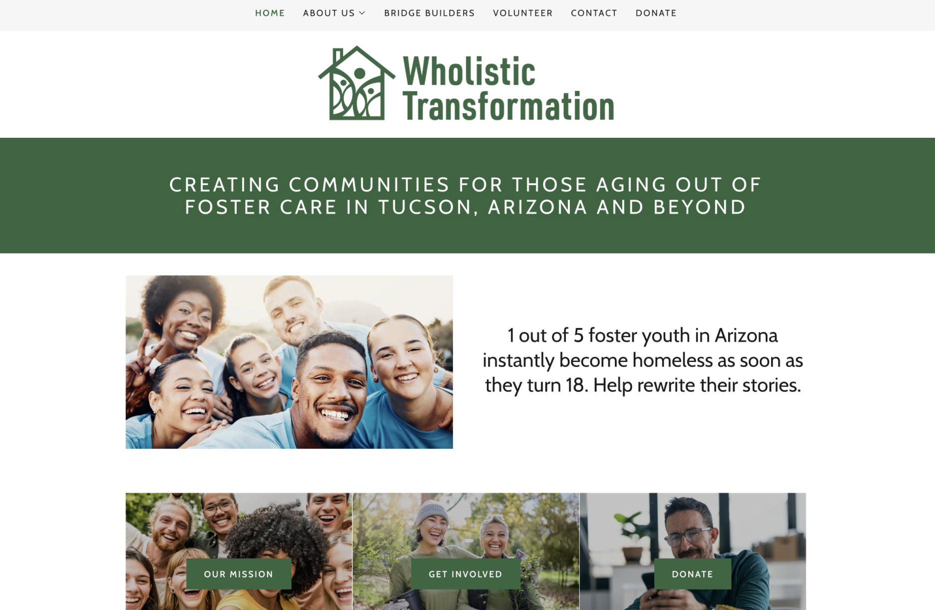
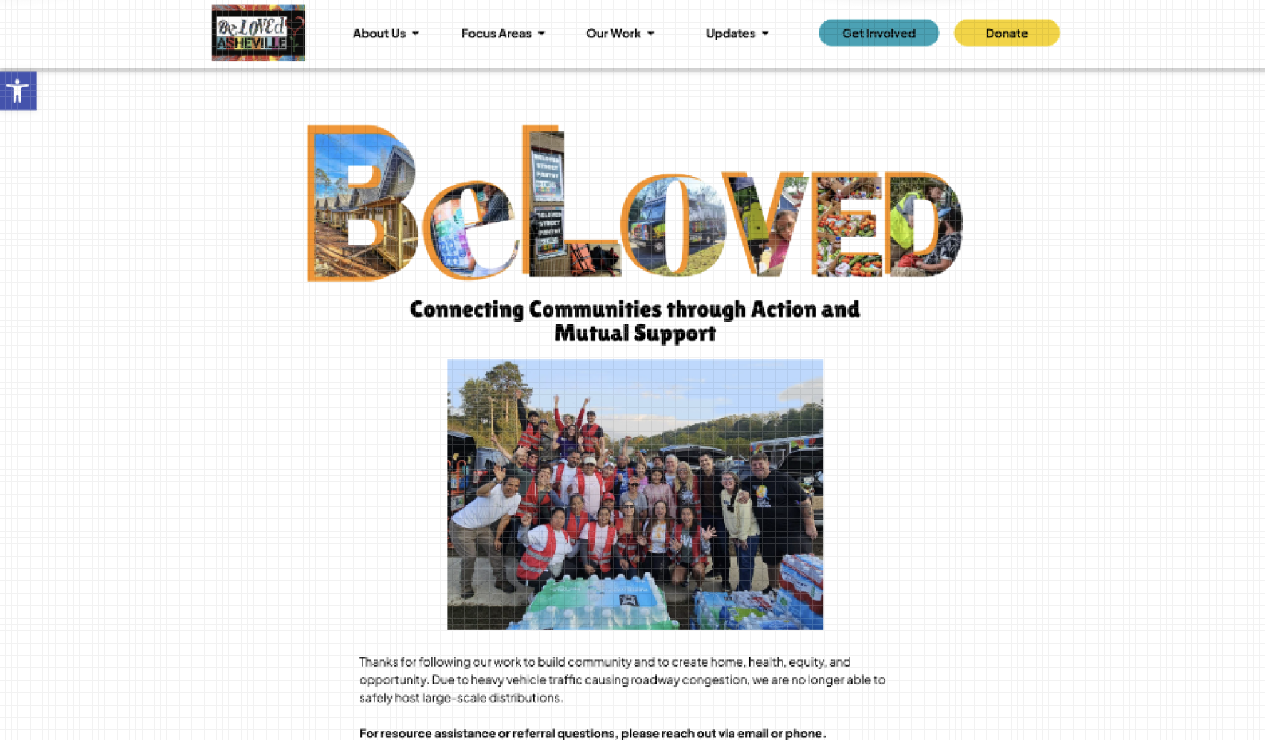
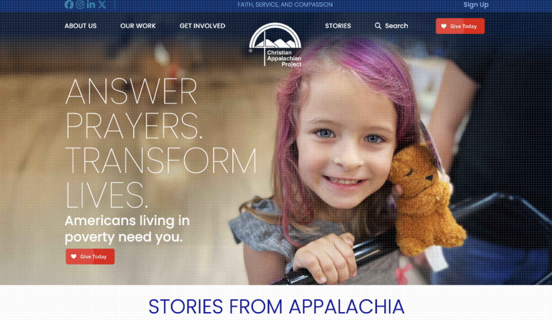
To understand how similar nonprofits communicate their mission, build trust, and drive engagement, I analyzed comparable organizations in the housing and community development space.
I also researched the issue of housing and food insecurity, along with the Hermit’s Peak Fire in New Mexico, to better understand the issue and how CHI was born.
Key Takeaways
Many nonprofits in similar spaces as CHI include information about their impacts in the communities they serve.
They may include statistics and stories on their websites that demonstrate the severity of the issues they seek to solve.
CHI has an opportunity to make a high-quality website that is clear on its mission and call to action. However, since it’s still in the R&D phase, it will need to have an alternative to its impact.
Positioning will be important in order for CHI and its associated business to attract partnerships and grow.
Approach
I started with a black and white design, using the AI-generated logo concept the client provided and collaborating with the client to effectively tell the brand’s story.
A. Defining the Message
I clarified the nonprofit’s core narrative:
Problem: housing + food insecurity
Solution: toxin-free homes + greenhouses
Outcome: healthier, more resilient communities
B. Structuring the Experience
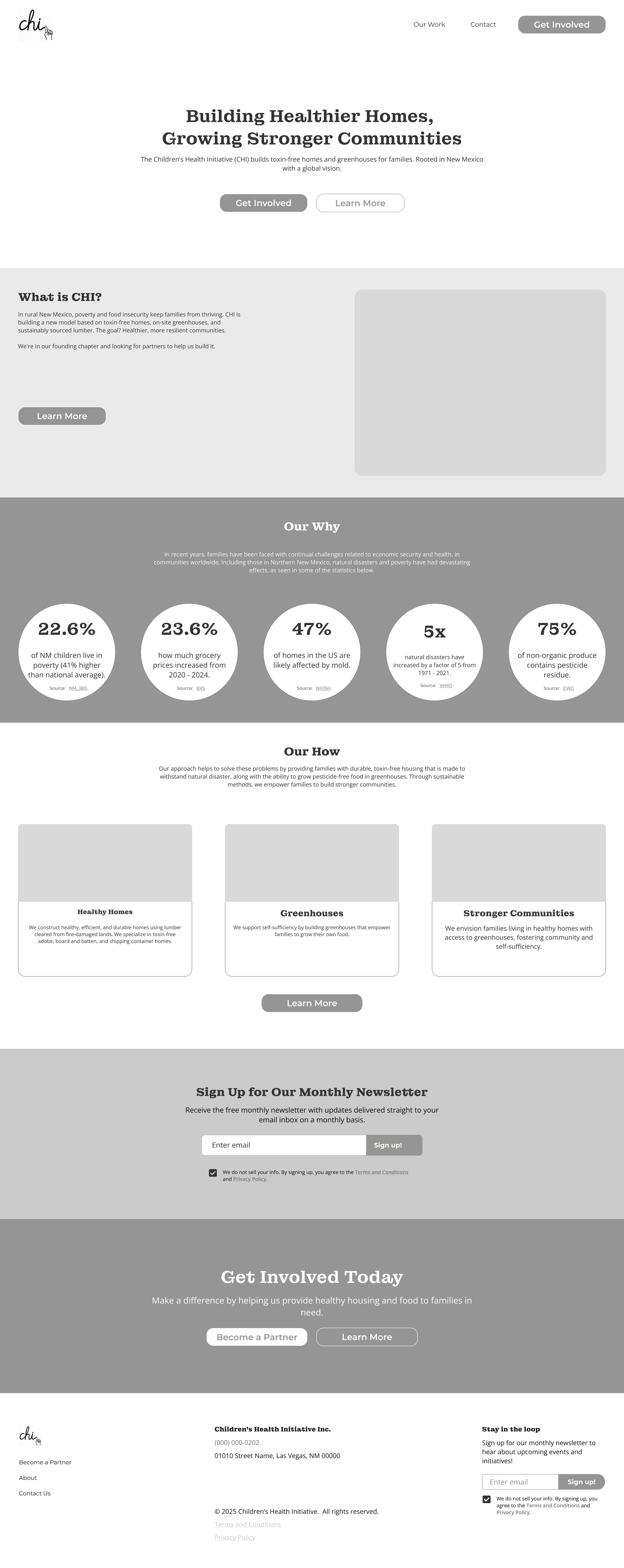
I designed the homepage flow to guide users from understanding to action:
What is CHI?
Why it matters (problem + data)
How it works (solution breakdown)
Call to action (Become a Partner)
C. Designing for Conversion
I designed the site to encourage partnership:
Repeated “Become a Partner” CTAs
Dedicated partnership inquiry flow
Clear explanation of value and impact
Key Decisions
Used statistics in the “Our Why” section to build urgency and credibility
Broke the solution into three clear pillars to reduce cognitive load
Added a “Five Year Plan” instead of an Impact section since CHI is still in the R&D phase.
Designed separate contact and partnership flows to align with different user intents
Kept language simple and direct to improve accessibility for a broad audience
Design
Brand System
Logo
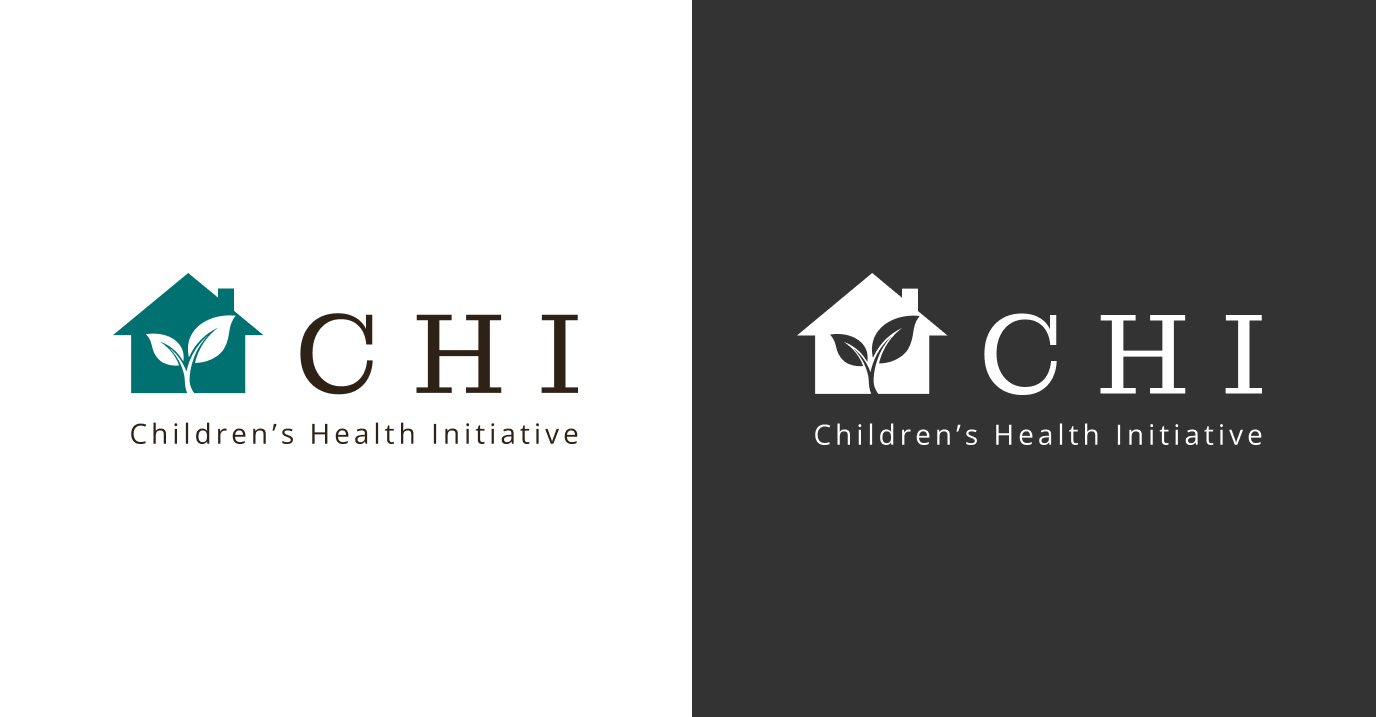
I designed a logo, which incorporates a house with a leaf inside, in line with CHI’s mission to provide both housing and greenhouses.
The leaf also signifies new life in the wake of the devastating wildfire in New Mexico.
Light and dark versions provide versatility.
Children’s Health Initiative and CHI are both used to establish the brand’s identity.
Palette
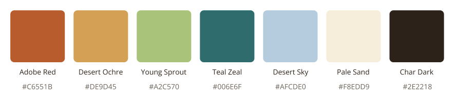
I selected a color palette based on the brand vision: Themes of adobe, desert bloom and sky, and the green of a greenhouse canopy. Grounded, warm, living.
Great for web and print materials, signage on vehicles and structures. Anchors the New Mexico identity.
Char Dark references the fire history without being heavy.
Typography
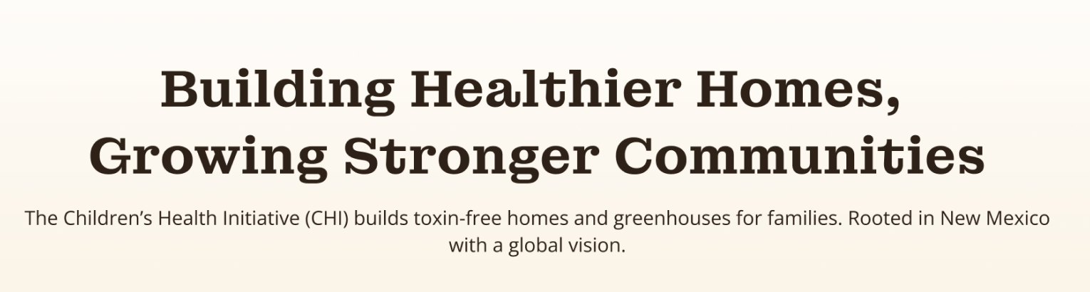
Montagu Slab for headings anchors the brand with a sense of place and groundedness, aligning with the New Mexico context.
Open Sans for body text ensures readability and accessibility across digital content.
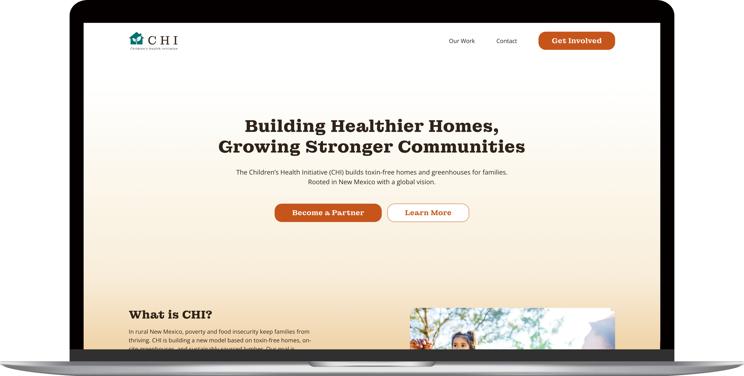
Final Homepage
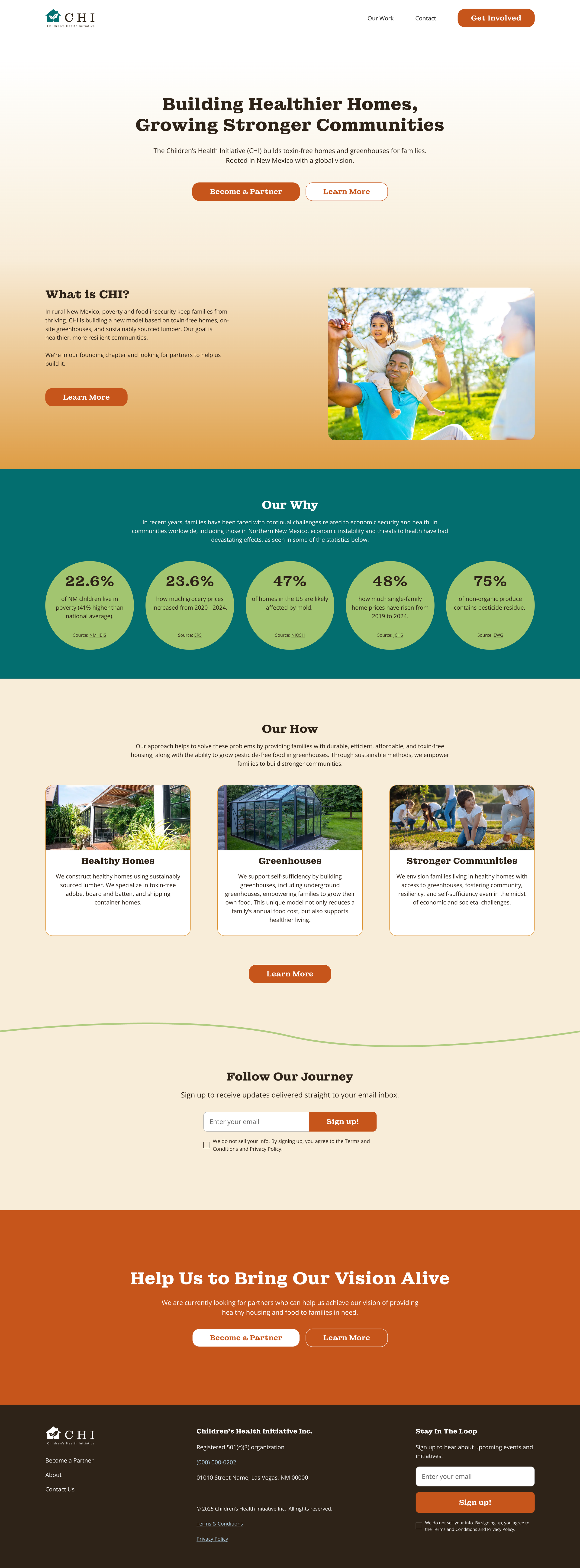
At the time of development, CHI was in the R&D stage, looking for potential partnerships, so the main CTA is to “Become a Partner”.
Down the line, we will likely add a “Donate” CTA.
Statistics related to the cost of living and food/housing insecurity build a sense of urgency in the “Our Why” section.
The “Our How” section demonstrates CHI’s approach to solving some of the issues in the “Our Why” section.
The brand colors and messaging are vibrant and earthy, appropriate for an emerging nonprofit related to housing and food security.
About Us Page: Messaging Framework
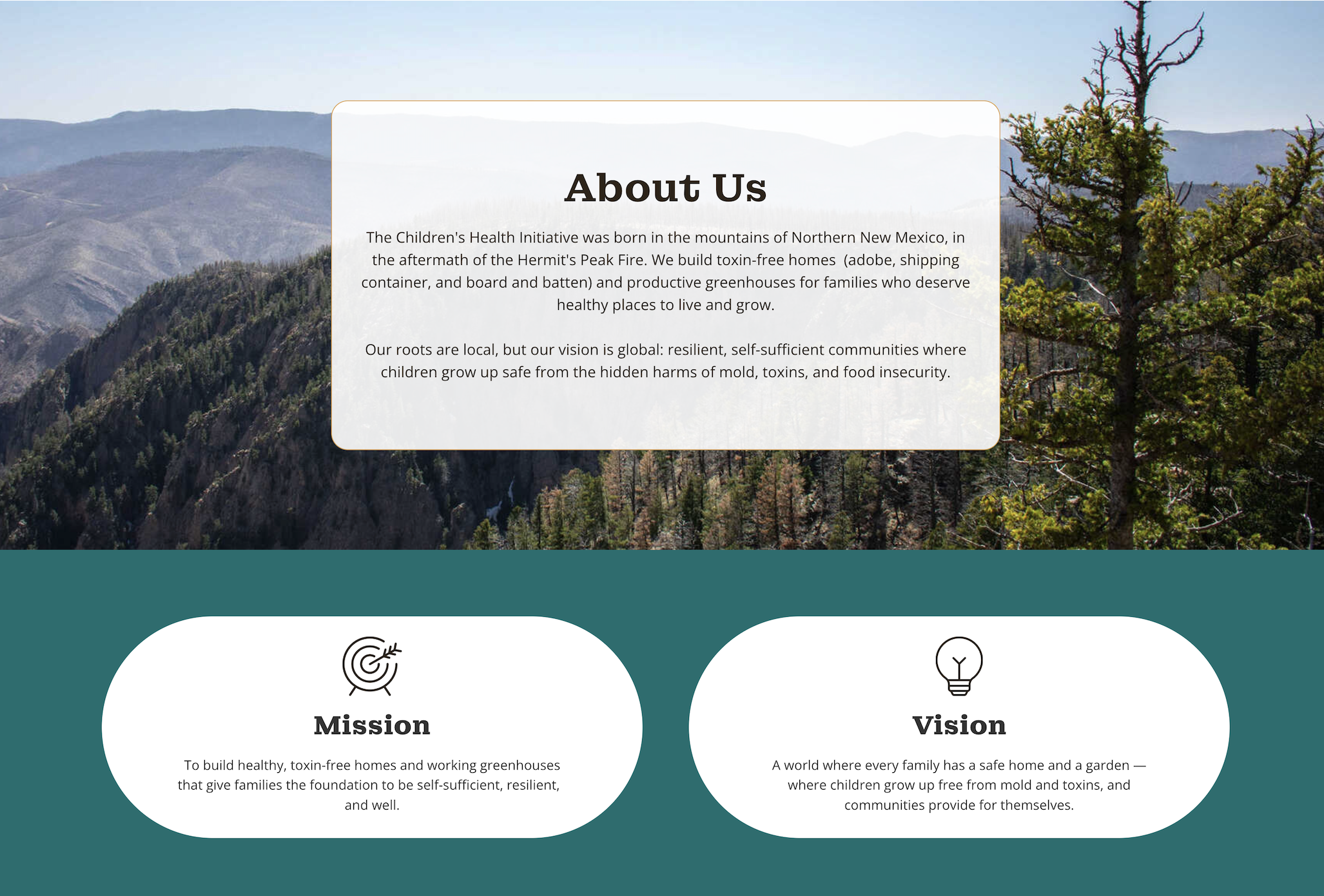
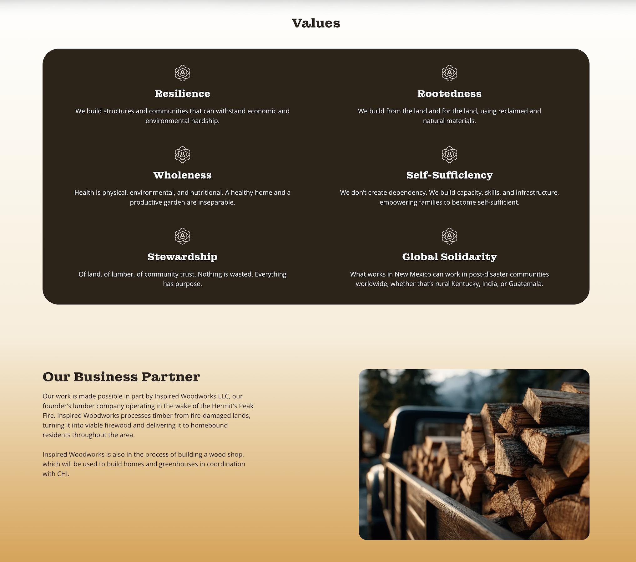
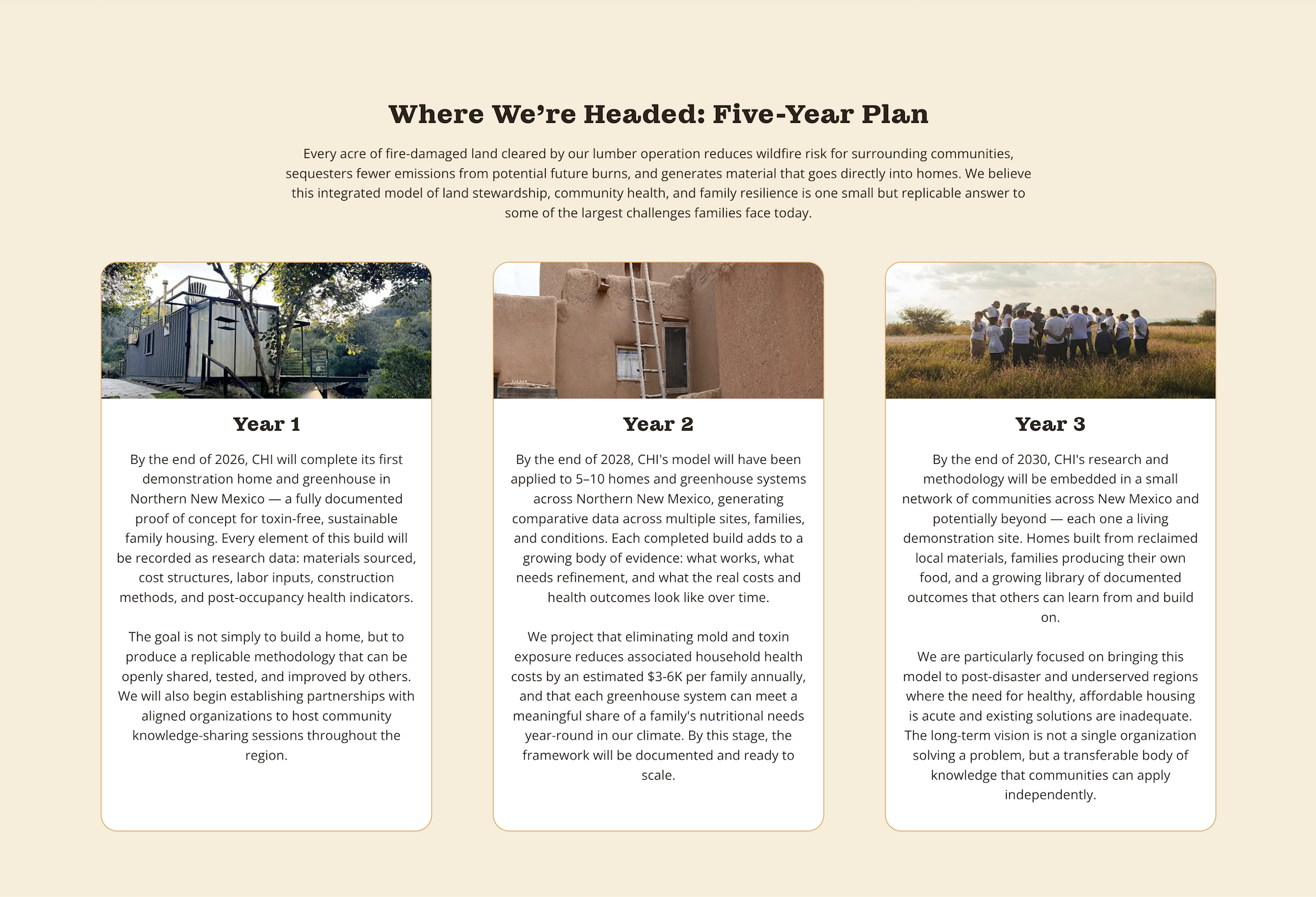
The About page gives information about how CHI was born.
In collaboration with the client, I developed a mission and vision for the site, helping to build rapport.
Based on my conversations with the client, I defined six values of CHI to foster trust with site visitors.
I also added a section about CHI’s business partners, which is important since its business partner owns the equipment CHI would use to carry out its mission.
When I conducted the market analysis, I found that many similar organizations had impact statements.
Since CHI was in the early stages of development, it did not yet have measurable impact.
Therefore, I suggested including a five-year plan.
The five-year plan also helped the nonprofit’s founder in clarifying his own vision and direction.
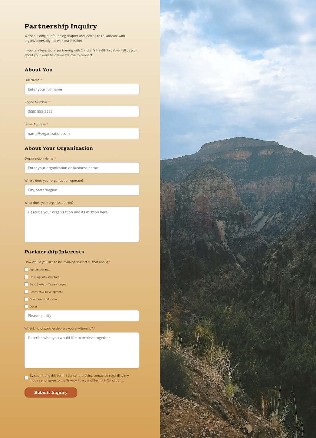
Partnership Inquiry Form
The partnership form is distinct from the website’s general contact form, targeting potential partners.
It’s broken up into three sections to reduce friction.
Someone filling out the form is required to add their organization’s name and information about what type of partnership they're interested in. This helps to filter out people who may not be serious without being too extensive.
The picture of Hermit’s Peak in New Mexico adds to the theme of the site.
Impact
Enable the nonprofit to confidently apply for partnerships and grants
Solidify the nonprofit’s mission, vision, values, and five-year plan
Support the nonprofit’s expansion
Recommended Next Steps
Consider adding a blog to the website
Establish social media accounts to expand digital presence
Research potential partnerships and grants