
Repositioning the Texas Water Controversy
The dispute between Texas and Mexico had gathered national attention, requiring a Texas state government agency to rethink how it was conveying its stance on the matter.
Role: Content Strategy, UX Writing, Information Design
Date: 2025
Status: Complete
Problem
A government agency in Texas was not effectively conveying its position on Rio Grande water allocation. The wording on the page was confusing, with a number of supporting documents attached with no explanation.
Approach
A. Researching the Issue
The original page provided a confusing overview of the issue, which did not effectively convey why the agency was asserting that Texas was entitled to the water at Fort Quitman. This was an issue especially after the controversy had gathered national attention in 2025. Many critics wondered why the agency was asserting that Texas is entitled to the water. I conducted research on the issue so that I could fully understand the history of the issue and the agency’s stance.
B. Structuring the Content
I redesigned the content after researching the issue, including the following sections:
Background on the Issue
[The Agency’s] Stance
Correspondence from 2008-2014 (with subsections)
Rio Grande Water Allocation Publications
C. Adding Visual
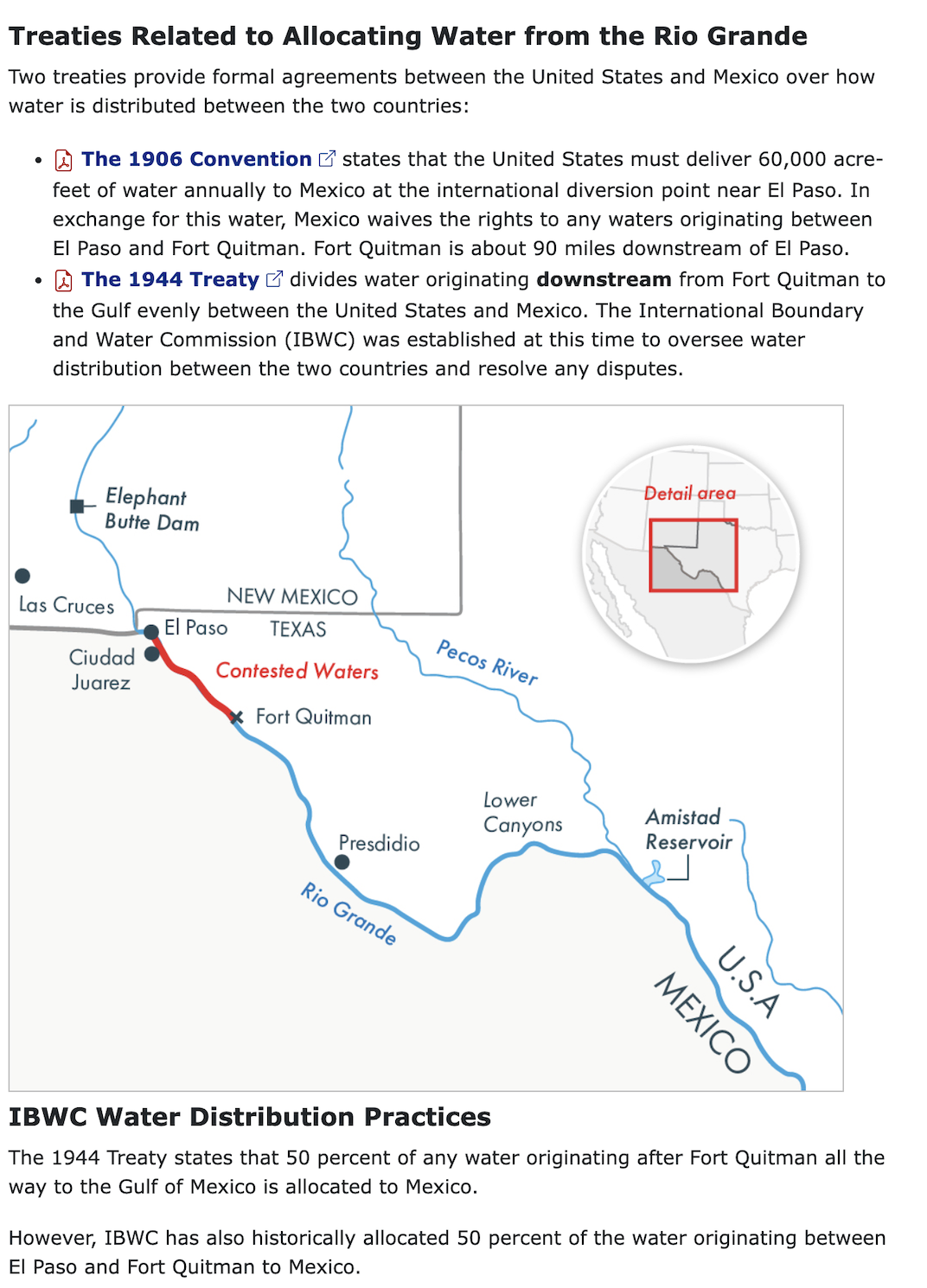
While I was researching the issue, I found myself confused about some of the locations mentioned in the content. I suggested including:
A graphic showing where the contested waters were
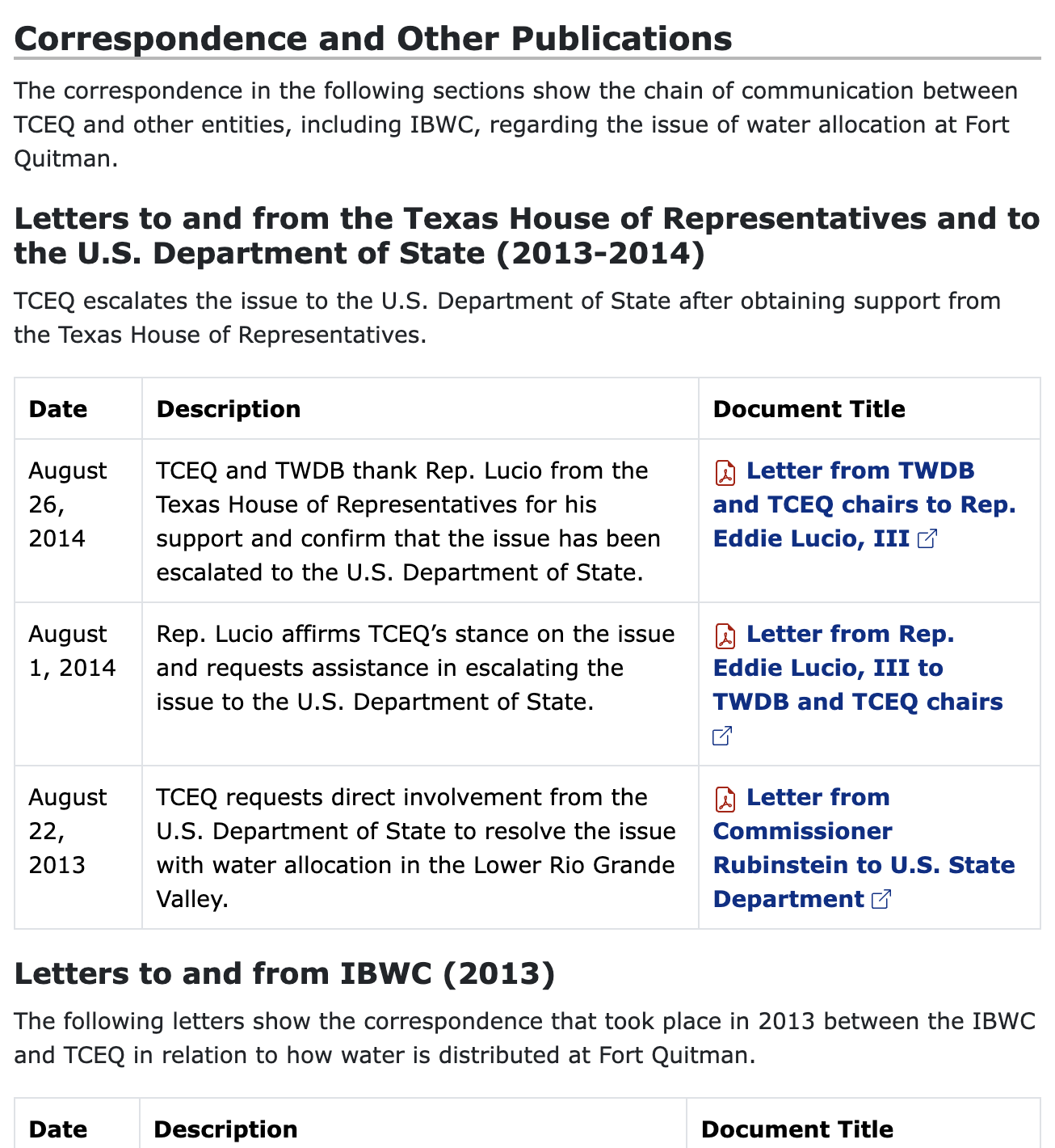
Tables for the documents, with dates and descriptions for each document
Key Decisions
Reorganize the sections, including background information about the issue
Revamp the content for clarity and concise without losing the original meaning
Adding a visual to increase understanding
Adding tables for the documents so that descriptions could be added, adding context to each document
Design
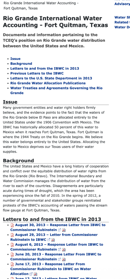
Before
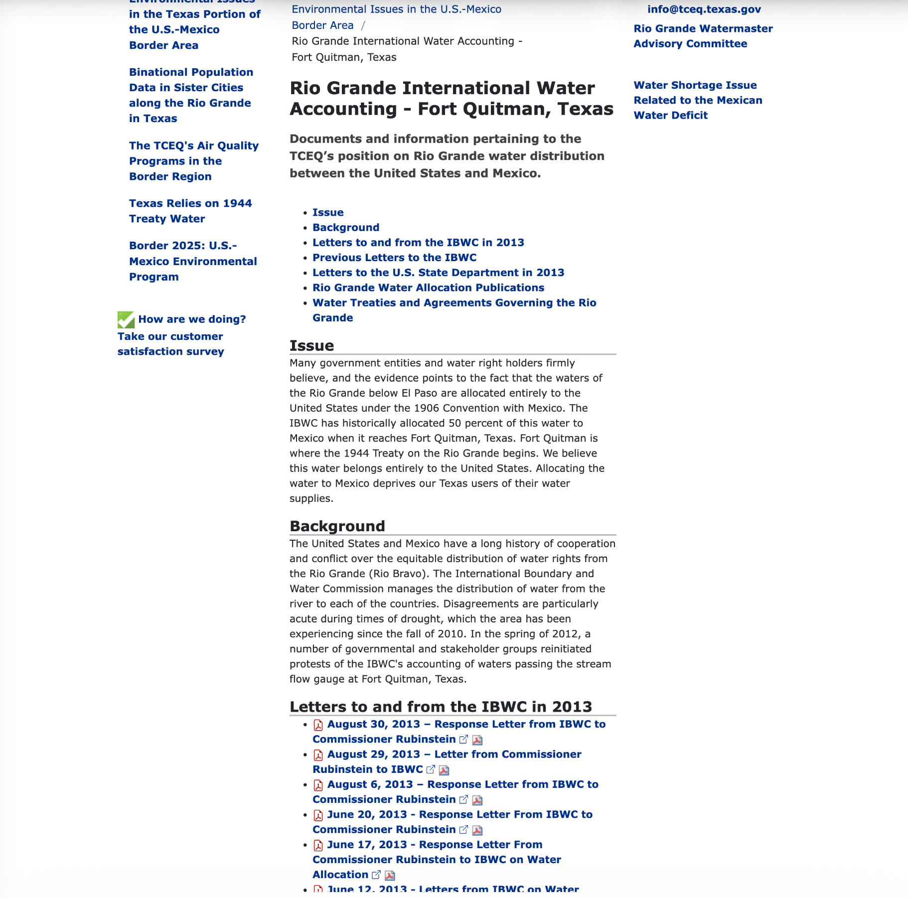
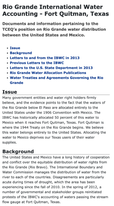
The original page did not clearly state TCEQ’s stance on the issue in the title or subtitle. It buried TCEQ’s stance in the “Issue”’ paragraph.
In addition, the “Background” paragraph seemed like it should go prior to the “‘Issue” paragraph.

After
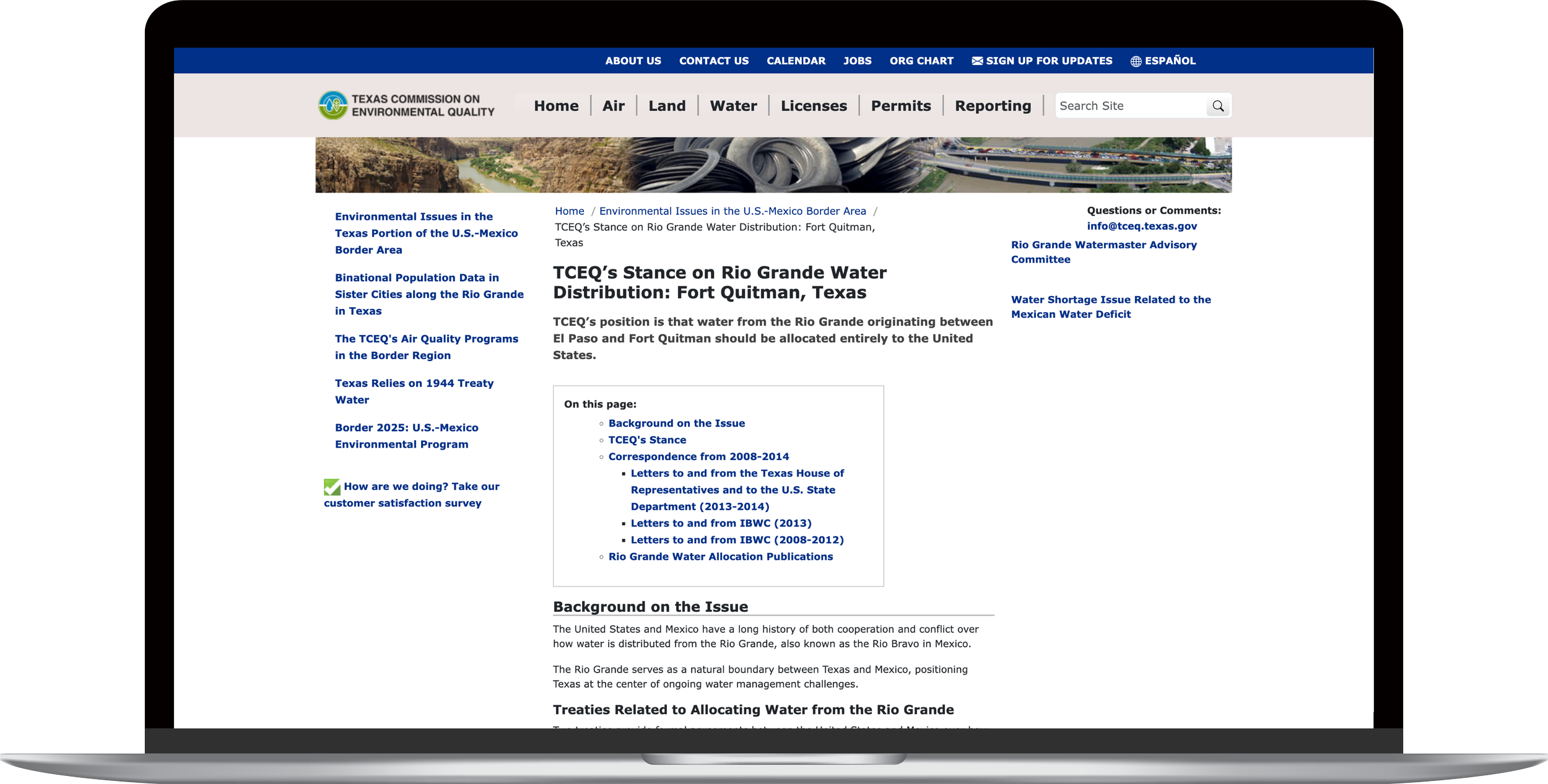
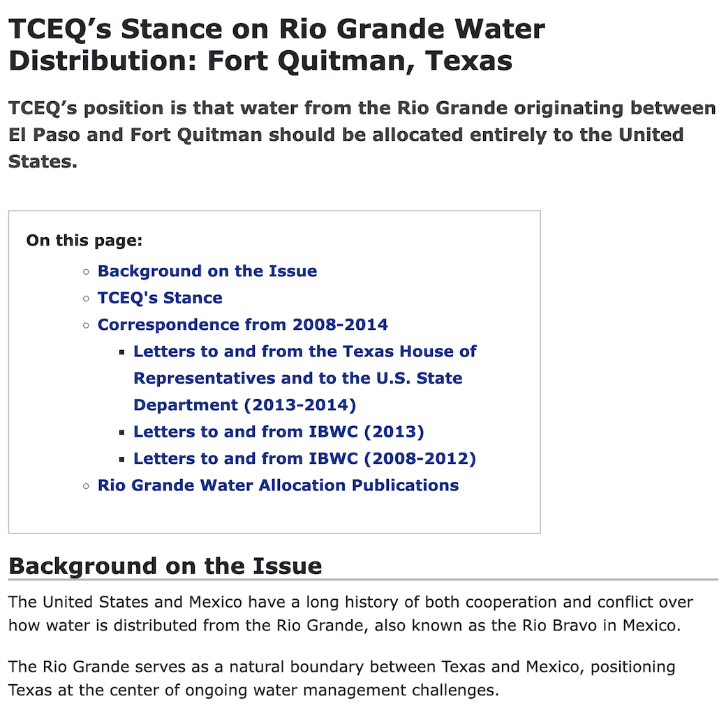
The title clearly states the purpose of the document, which is to convey TCEQ’s stance on the issue.
The subtitle clearly states TCEQ’s stance.
“Background on the Issue” is presented first, orienting readers to the problem at hand.
Before
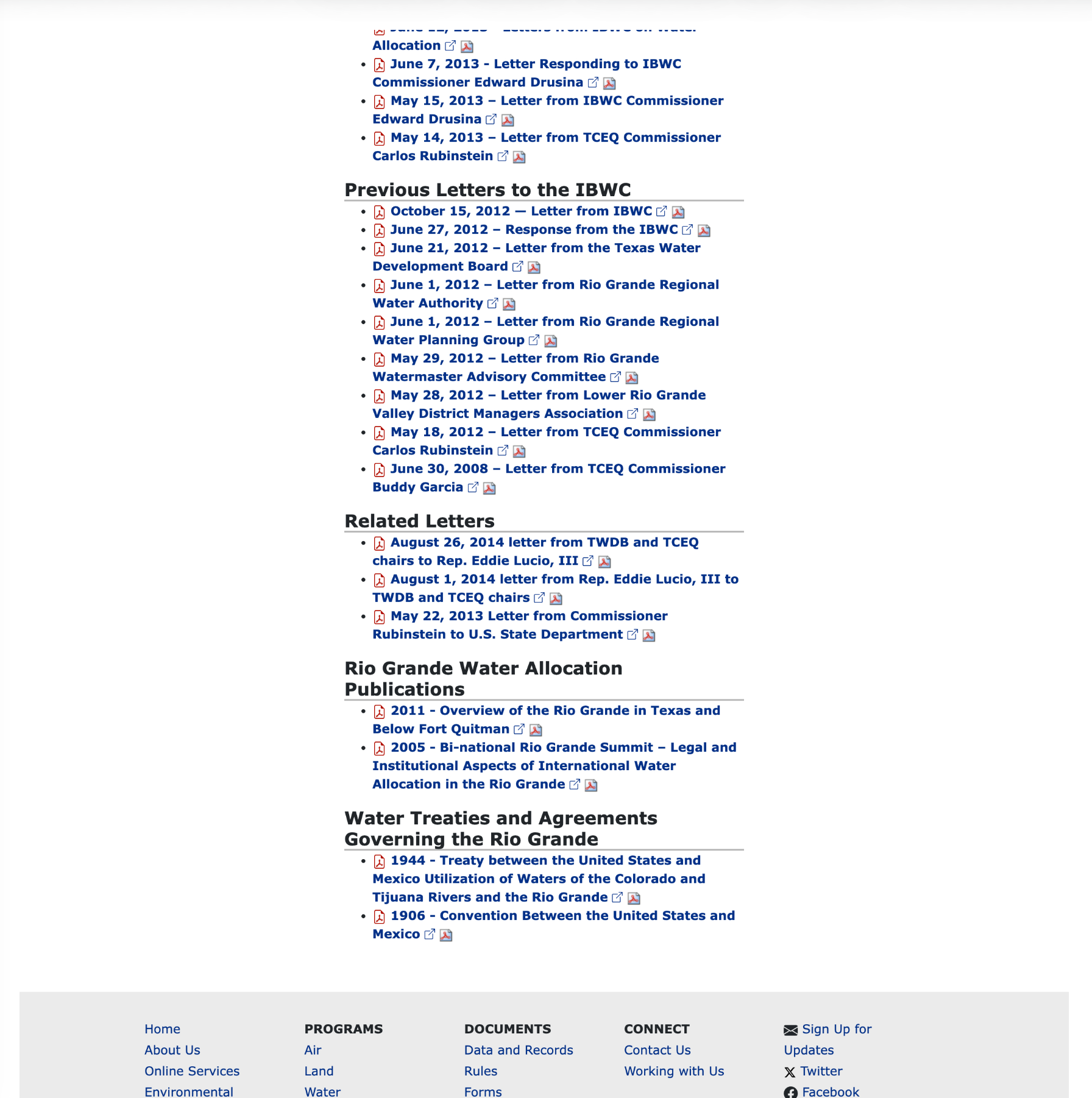
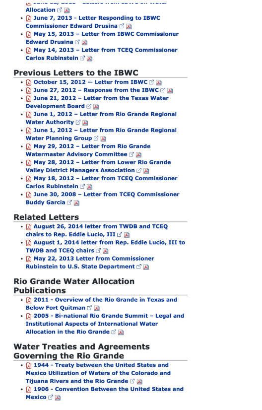
The original page included long lists of documents with no explanations.
The sections were not in chronological order, making it difficult for a reader to understand the order of events.
After
I recommended adding a table to organize the documents, adding dates and explanations for each.
I also suggested a new ordering of the sections in chronological order, with section captions.
This presentation helps TCEQ to better support its stance since these documents serve as some of the supporting evidence, documenting the chain of events.
Before
No visuals
No context for treaties that serve as the foundation for TCEQ’s stance
After
Visual providing context on the geography for the contested waters
Clear information on the treaties that serve as the basis for TCEQ’s stance
Impact
Improve reader comprehension
Improve reader trust
Improve rapport with the public as a result of clear messaging on a controversial issue
Recommended Next Steps
Add an update addressing new developments surrounding the issue, in light of recent controversies
Improve pages related to this one and the overall site’s architecture