
Streamlining Recruitment: Unifying Legacy Systems on a Single Platform
Date: 2024
My Role: Lead UX Designer (solo contributor on design, working with sales and leadership teams)
A mid-sized recruitment agency was drowning in operational inefficiencies. Their workflow relied on disjointed spreadsheets and fragmented legacy systems, forcing recruiters to manually re-enter data multiple times a day. This not only slowed down the placement process but led to frequent human errors and frustrated staff. They needed a unified platform to centralize their operations and eliminate double-entry.
Problem:
The recruitment agency was operating across multiple spreadsheets and systems. To increase efficiency, it wanted to create a custom platform integrated with its systems and enabling streamlined processes.
There are three main types of users at the agency: service team members, recruiters, and executives. The system must provide different views for each of these user types.
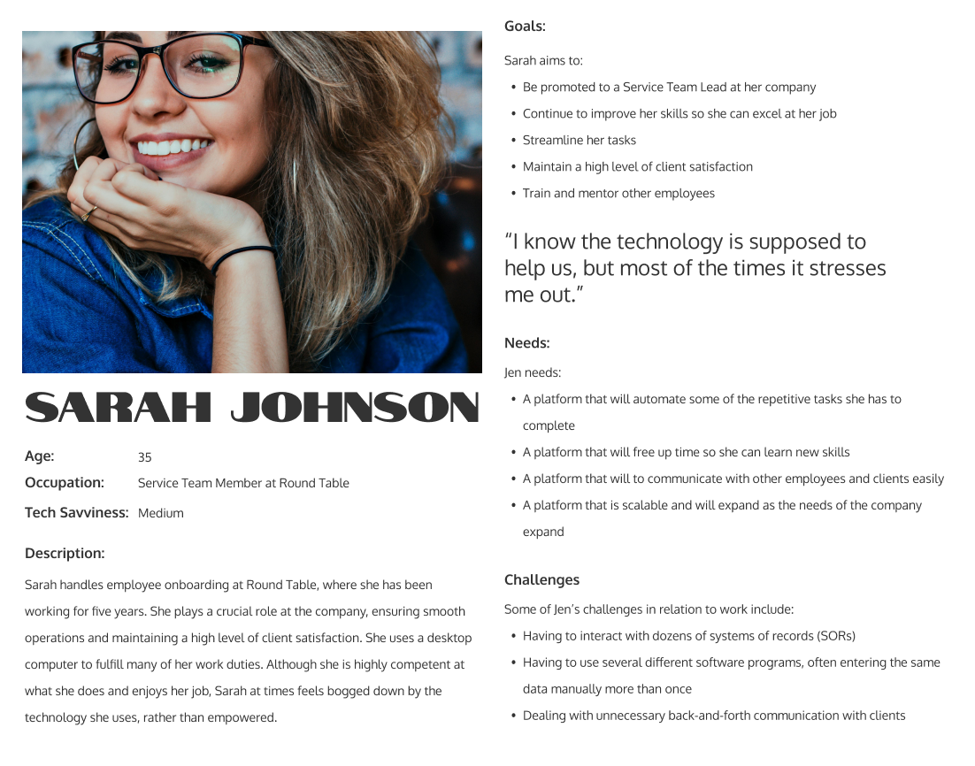
Service Team Member Sarah
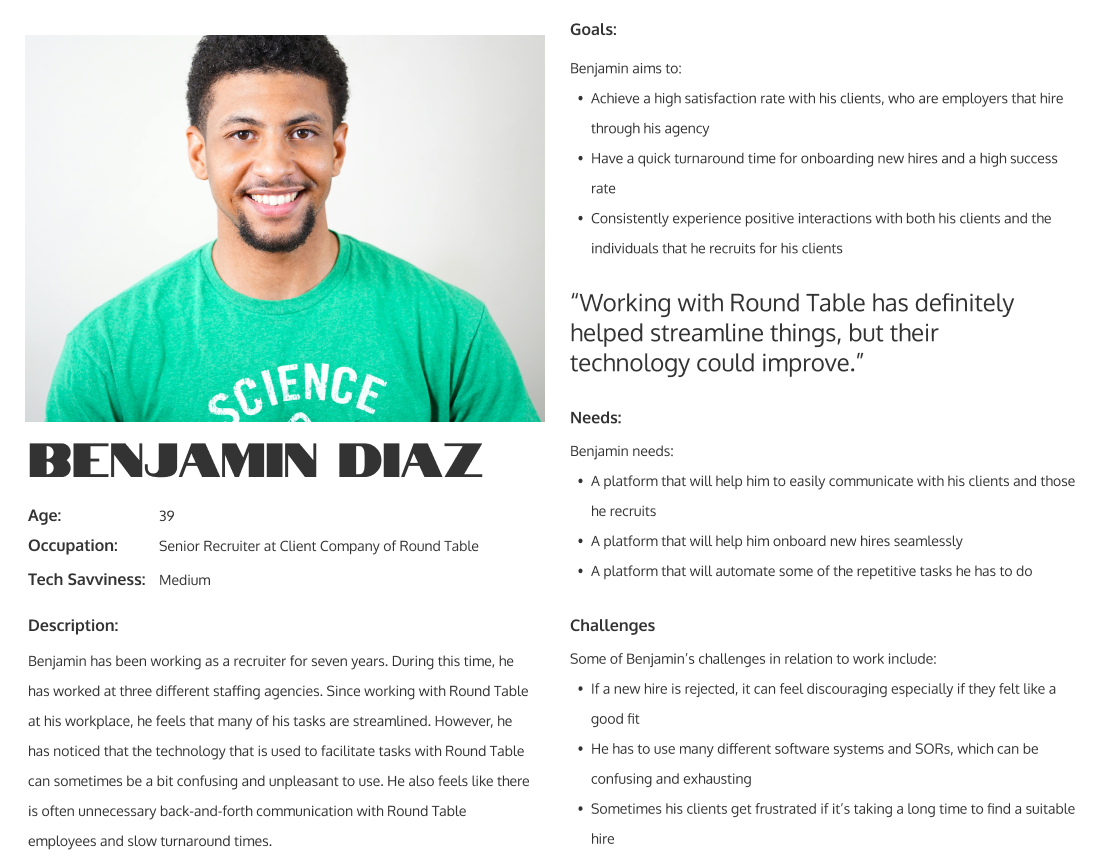
Busy Recruiter Ben
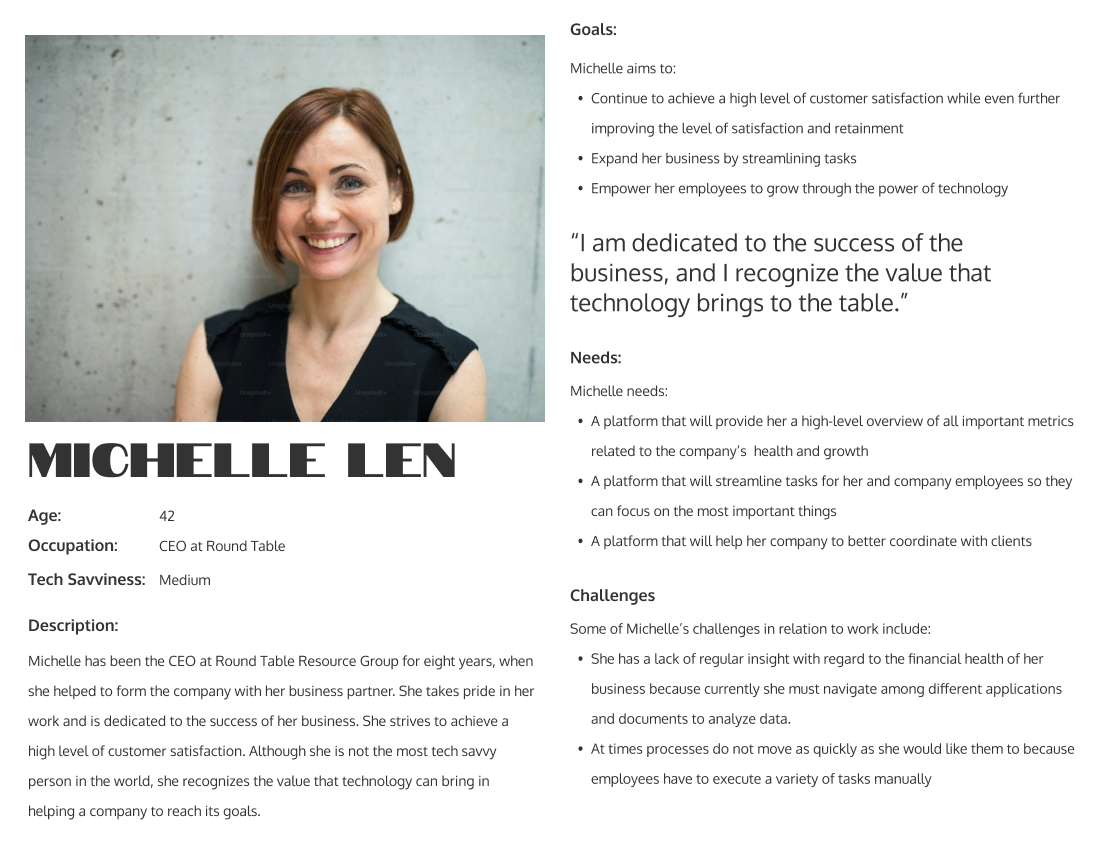
Michelle the Executive
Initial Iterations
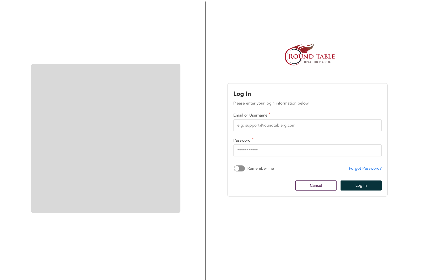
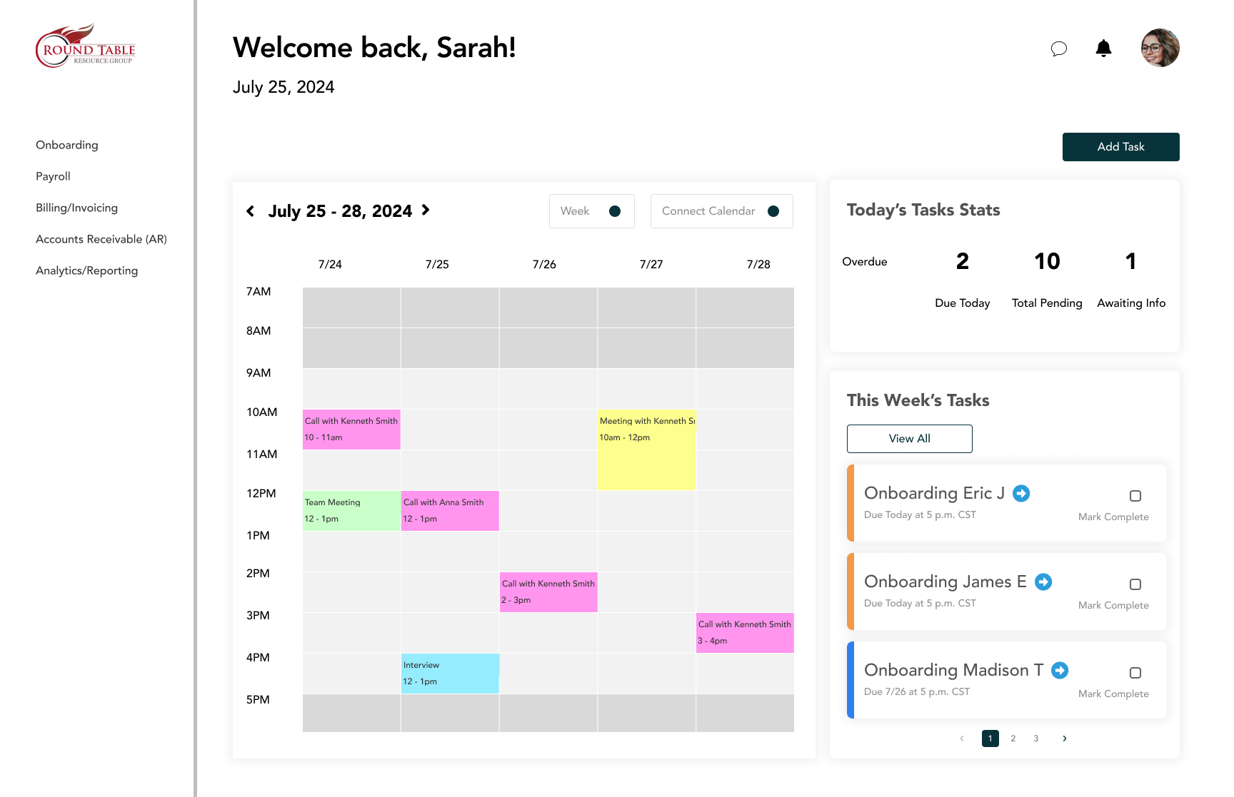
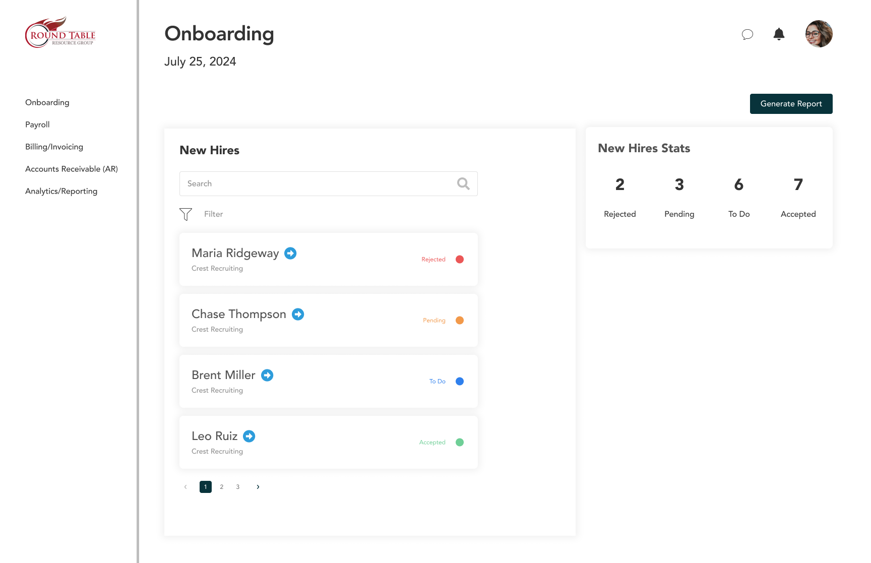
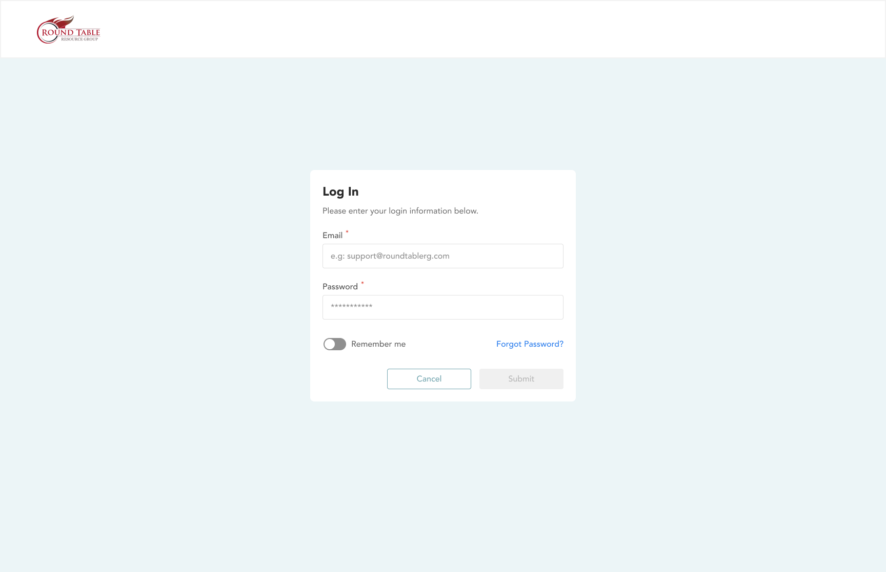
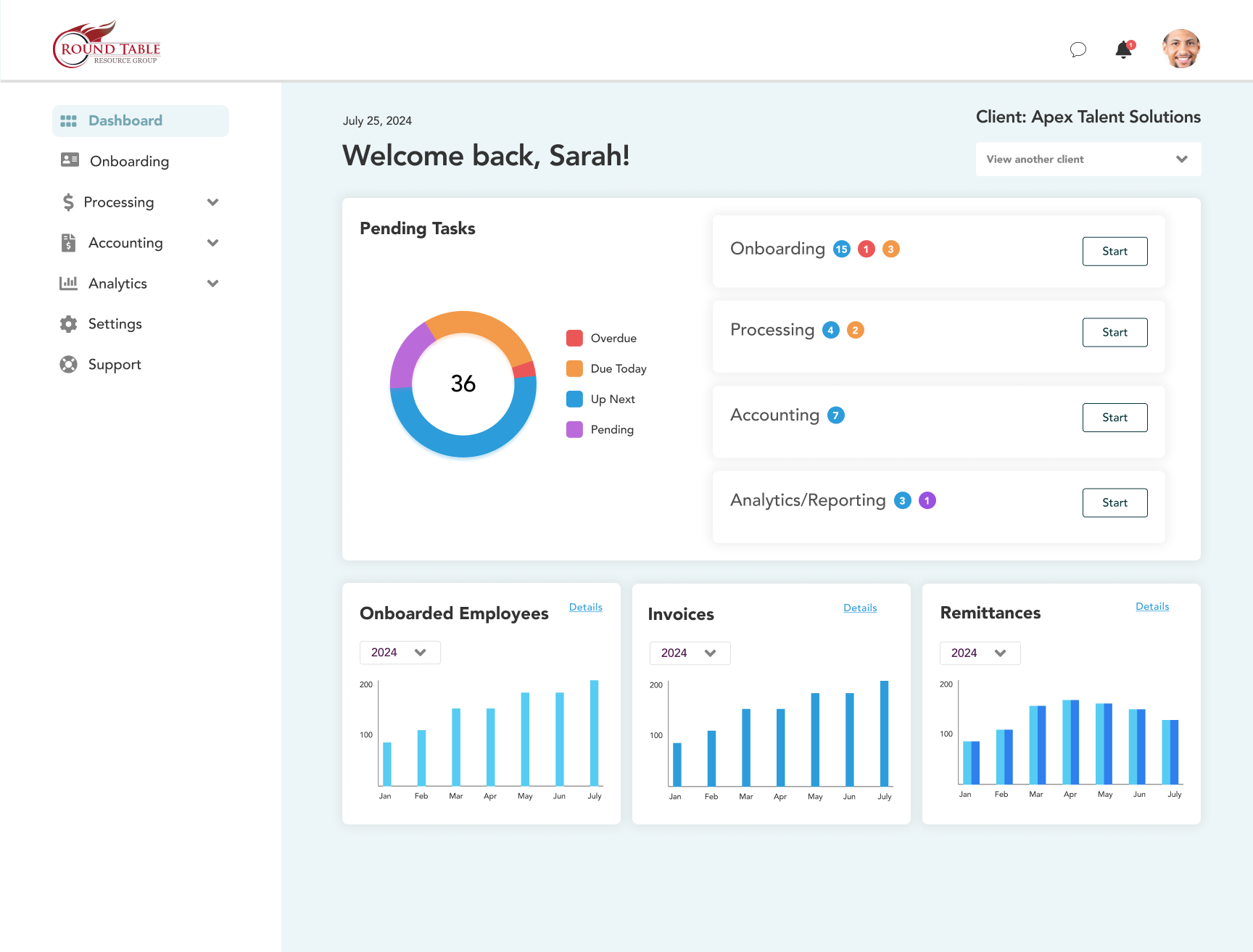
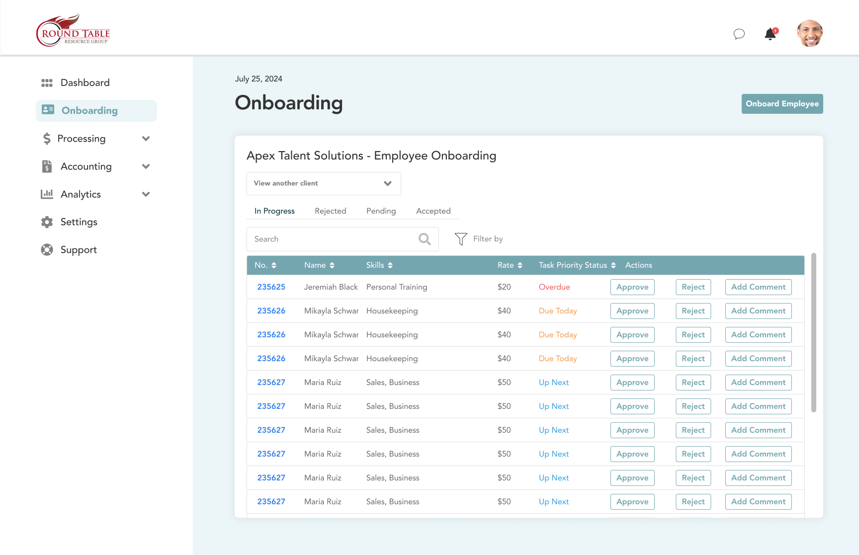
Once I defined the information architecture, I created some initial designs, considering the needs of the users.
Final Solution
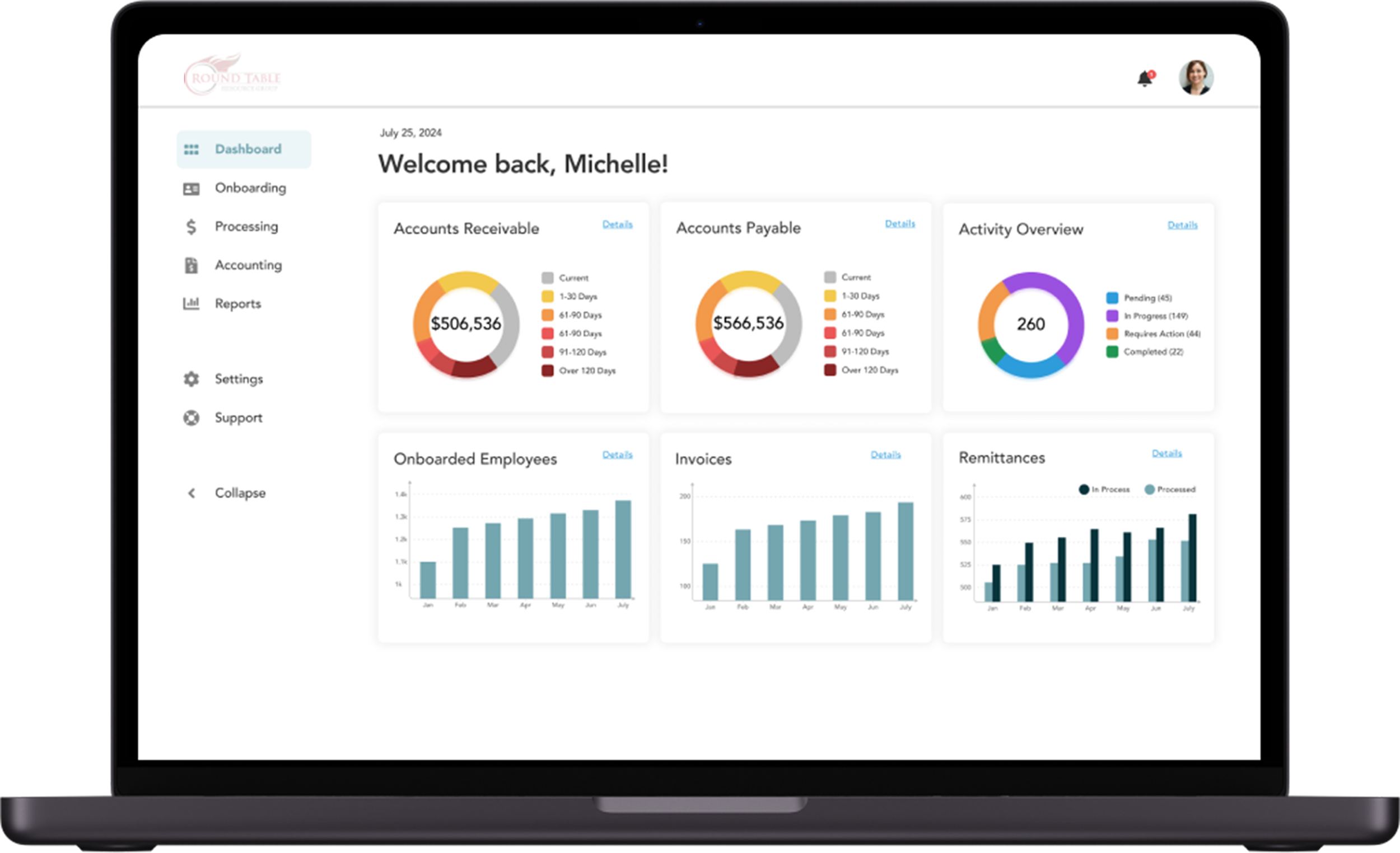
The end result is a custom system that allows executives and employees to seamlessly execute tasks on one platform. It is integrated with existing systems.
In the end, I opted for a clean white background to create a professional look that’s also easy on the eyes I incorporated teal blue accents complementing the brand’s existing red theme (in the logo).
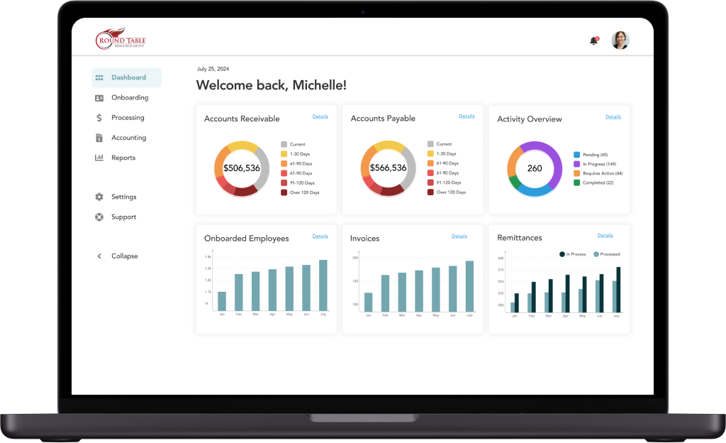
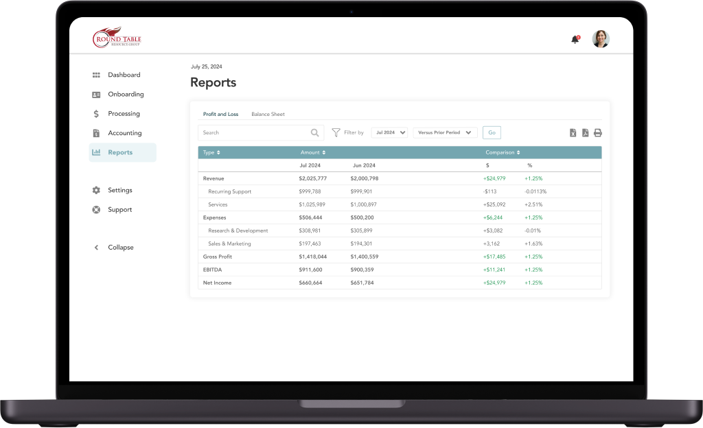
Executive View
Focused on high-level metrics. I created a view that gave leadership a bird's-eye view of financials and team performance without needing to dive into the weeds. The "Settings" panel was designed to show sync status with third-party platforms, giving admins confidence that the data pipeline was working.
Employee View
Focused on efficiency and speed, the system eliminates the need for double data entry across spreadsheets and platforms.
Easy Communication
I added a native comment feature allowing employees to tag clients directly within the platform. This eliminated the "email tag" that often delayed client onboarding.
Streamlined Onboarding
The old system required users to scroll through a massive form. I redesigned this using a "Stepper" pattern (breaking the form into steps) and multi-column input fields. This significantly reduced scrolling and cognitive load, ensuring that the complex data entry process felt manageable and less prone to error.
Outcome
The company drastically reduced its data entry across platforms, with an estimated 50% increase in efficiency.
In addition, employees were able to more easily scan data to make decisions on the fly.