UX/UI CASE STUDY
CAPPS Application Revamp
Date: Oct - Nov 2024
By: Victoria
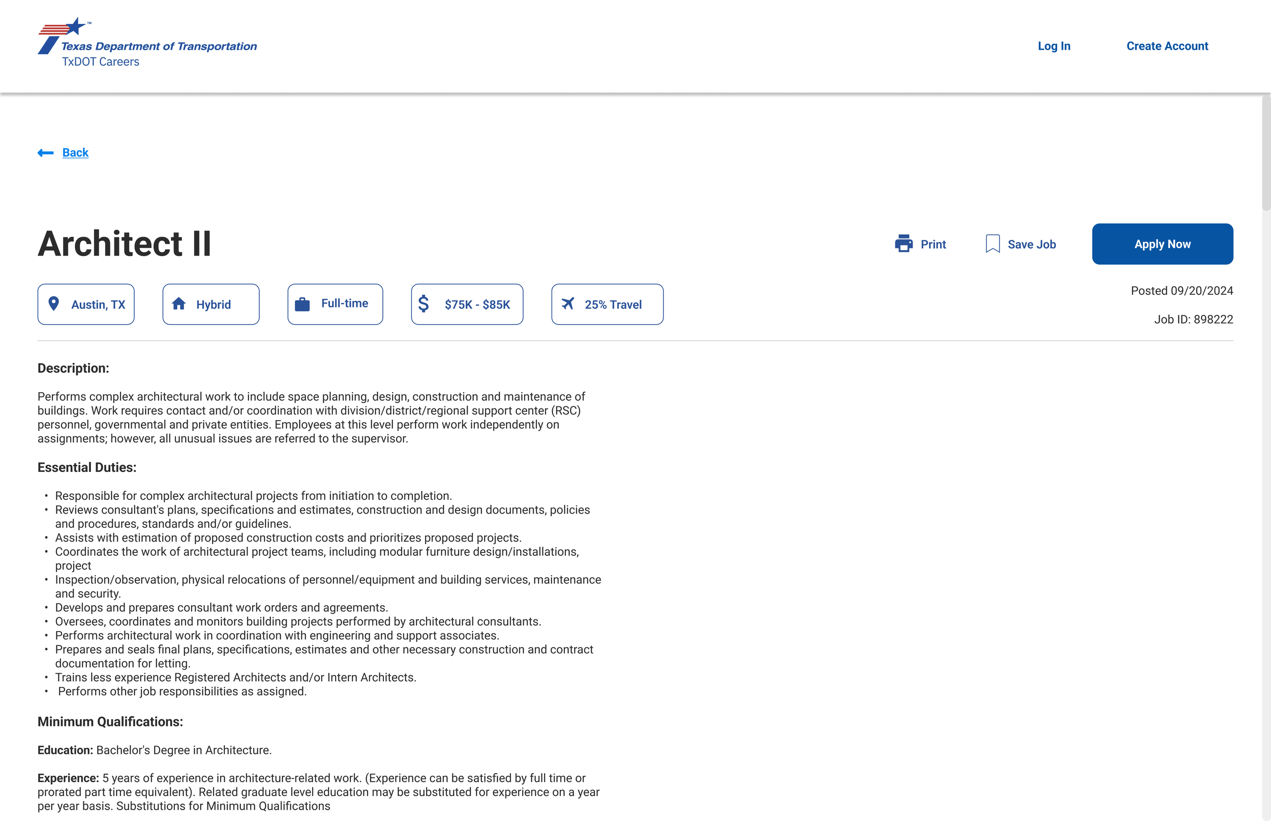
A system called Centralized Accounting and Payroll System (CAPPS) is used by Texas state entities such as the Texas Department of Transportation (TxDOT) for many functions, including online employment applications.
I redesigned the CAPPS application on my own volition after experiencing a very frustrating application process while trying to apply to jobs at different state entities, include TxDOT.
Issues
1
Outdated UI
Outdated UI
Excessive text
Design of application site is different from employer’s website, creating a disjointed feeling
Issues Creating Account
2
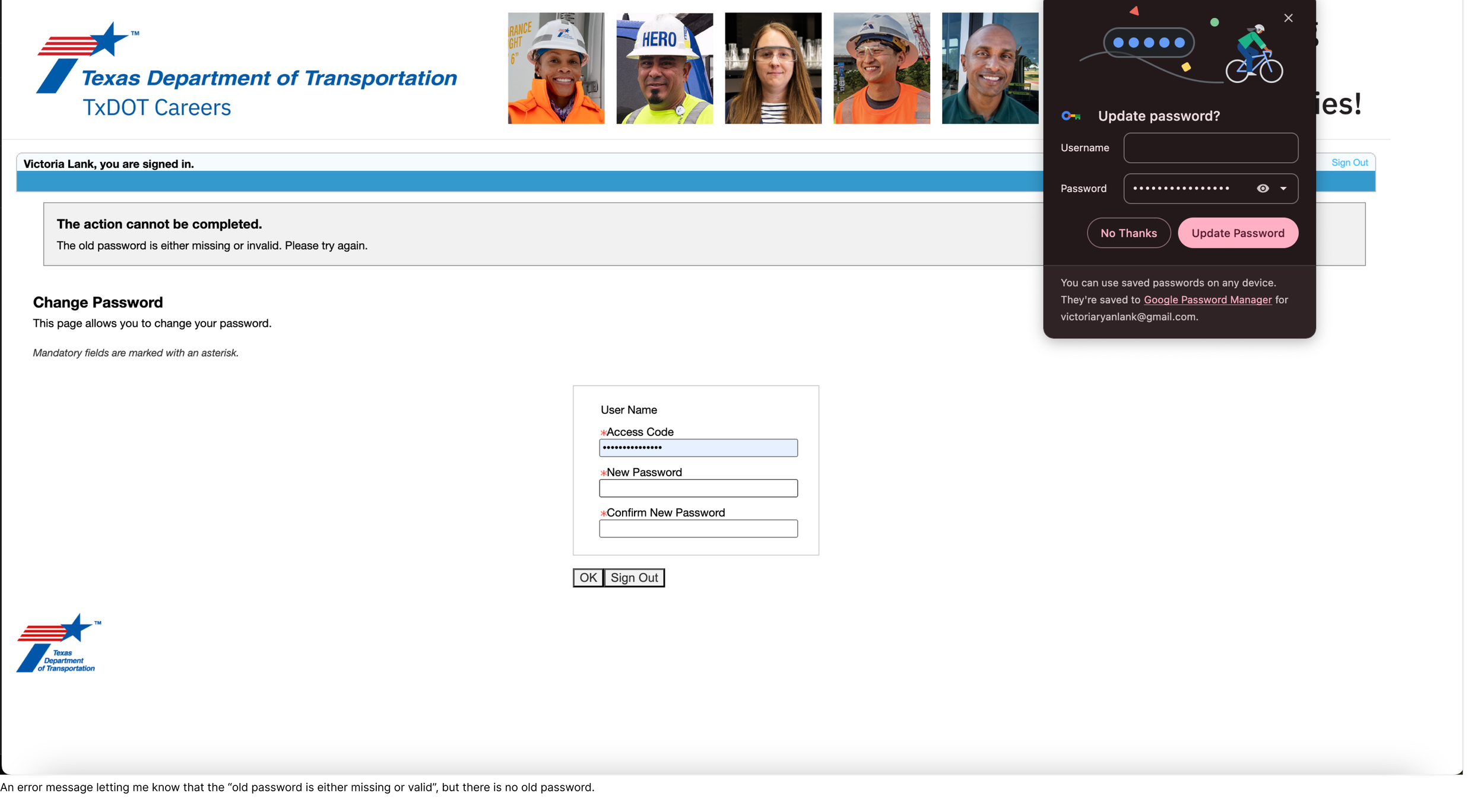
Each entity uses a different login, but they don’t make that clear when you are logging in to apply
Can’t save username and password for the above reason as doing so will result in a headache trying to create an account for a different entity
Cannot reset password due to “old password” being “missing or invalid” - this resulted in me having to contact technical support
The username is different from the email address, causing issues
No flexible sign-up options
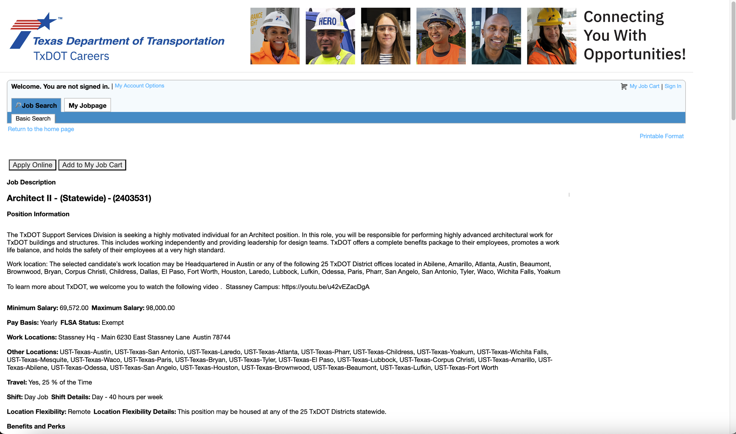
Inaccessible Form
3
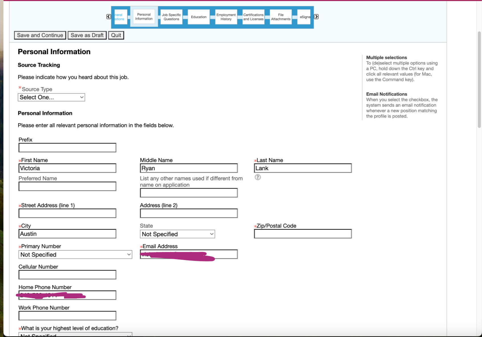
Unnecessary outdated questions (e.g., supervisor’s name and contact info for each job)
Multiple columns, causing overwhelm
Excessive text
Error message for incomplete fields is not distinctive
Odd Presentation of Voluntary Disclosure Questions
4
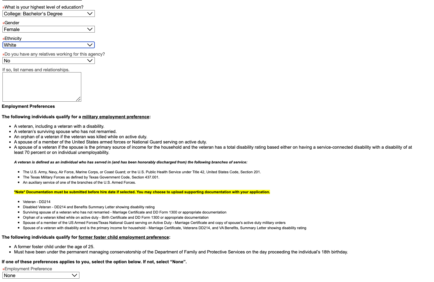
Voluntary disclosure questions are thrown in with other application questions, which is overwhelming and feels disjointed
Voluntary questions are marked as required, though the user can select “Decline to answer” from the dropdown
No anti-discrimination notice is provided
Research / Process
Step 1:
Analyze Other Applications
To gain inspiration and perspective, I started by analyzing other applications that required a long form to be completed in addition to uploading a resume. The main points from two are outlined below.
Workday
Workday is used by many different employers, including Austin Community College (ACC).
Strengths: clean UI, autofill with resume, don’t have to initially create account, can’t view/edit resume info
Weaknesses: multiple steps required, some parsing/editing issues with experience (especially certifications), must create different Workday account for each employer
Opportunities: consolidate applications under one Workday account, make editing experience easier
Threats: some forms may not require work experience to be edited
ADP
ADP offers an application solution utilized by employers such as FEI Systems.
Strengths: uses AI to analyze resume, clean UI, easy to use, user doesn’t need to edit content from resume other than contact info
Weaknesses: user can’t view/edit what’s been parsed from resume, many external links to view agreements/statements, user may wonder about AI agreement, must enter full street address
Opportunities: allow candidates to edit application after it’s been submitted, prevent duplicate accounts from being created under same user
Threats: competition, may be difficult to get buy-in from candidates
Step 2:
Identify the User
The primary user for the flow we’re redesigning is a candidate. Other possible users include hiring managers, recruiters, and administrative users. There may be other candidate personas, including those with varying levels of education and different professional backgrounds.
Step 3:
Visualize the Flow
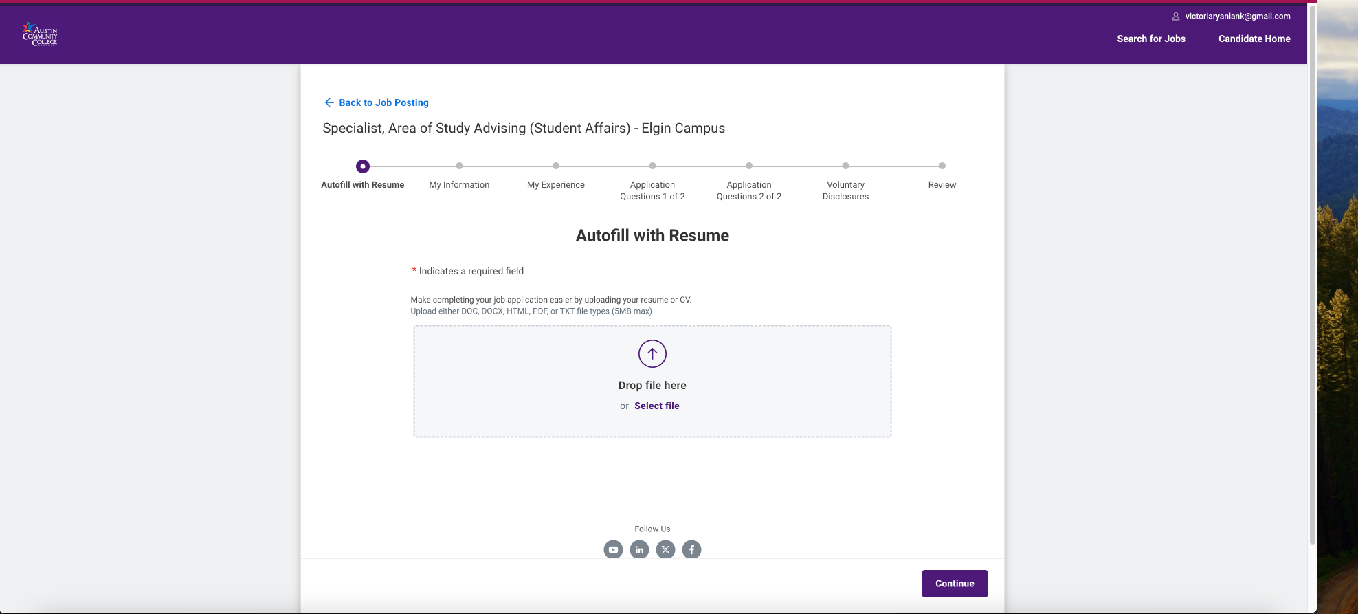
After analyzing some other applications requiring steps, I started with a main user flow and some low-fidelity wireframes using frame0 to begin visualizing how users would interact with the application. I then transitioned into Figma, creating mid-fidelity wireframes before creating the final mockups.
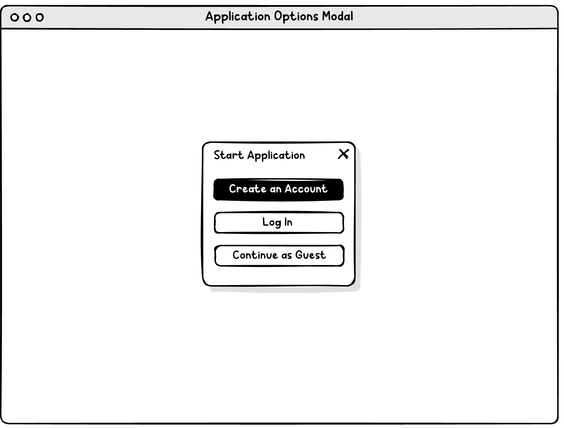
Encourage user to create account to prevent data loss issues with the form, but provide guest option.
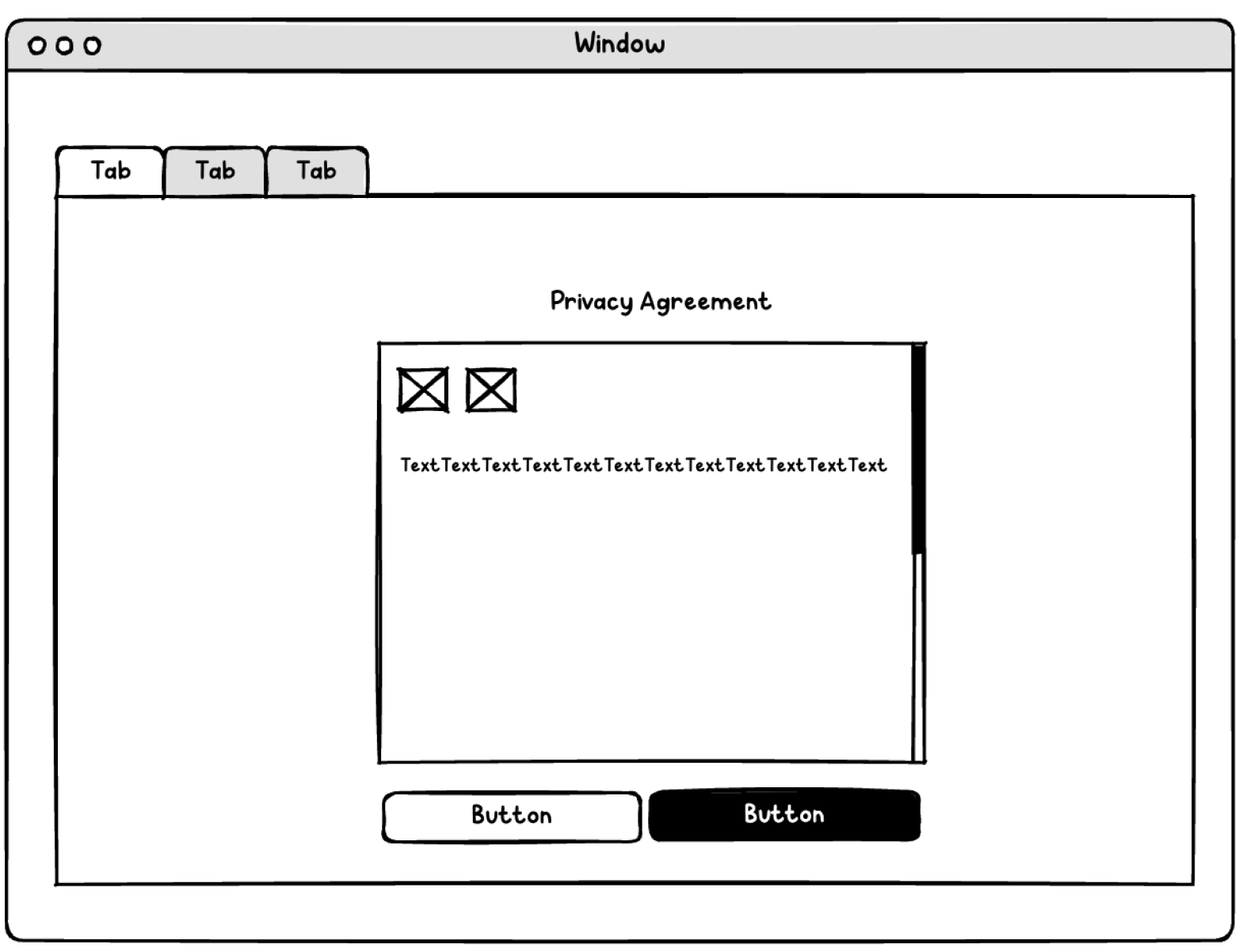
Consider wide margins for the privacy statement, increasing readability. Add a read-aloud option for accessibility.
Provide convenient signup options
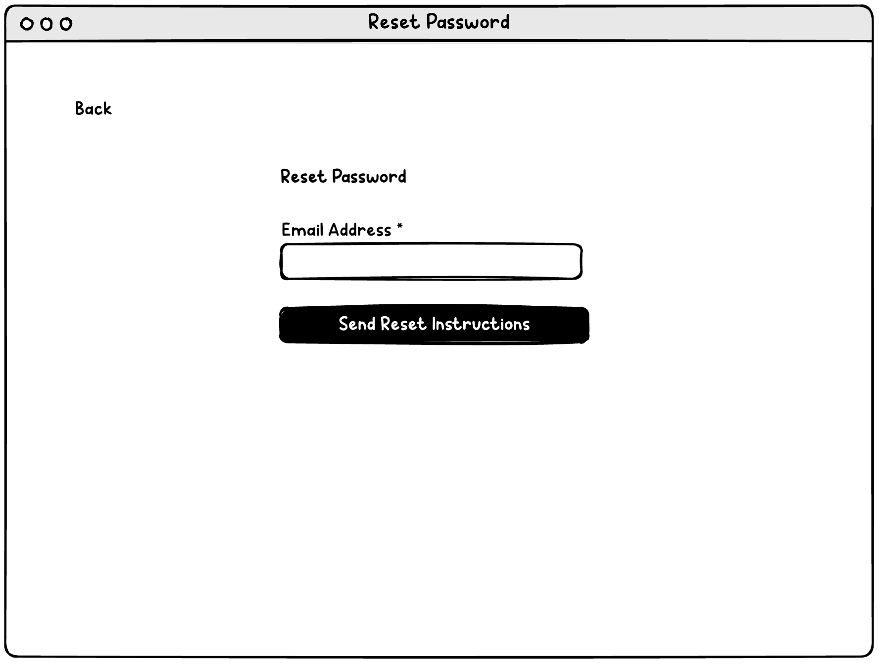
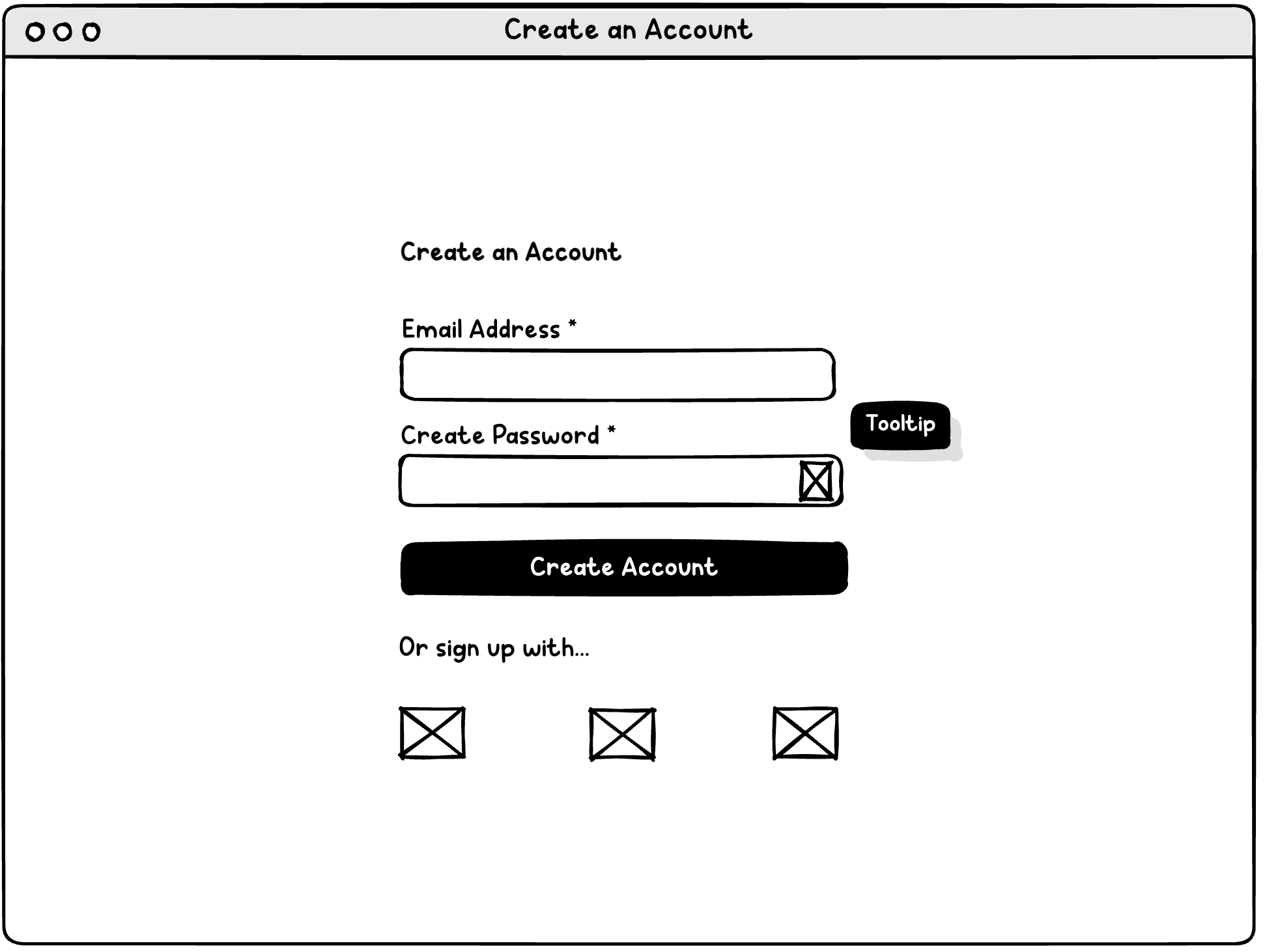
Make email address the username, eliminating need to reset username
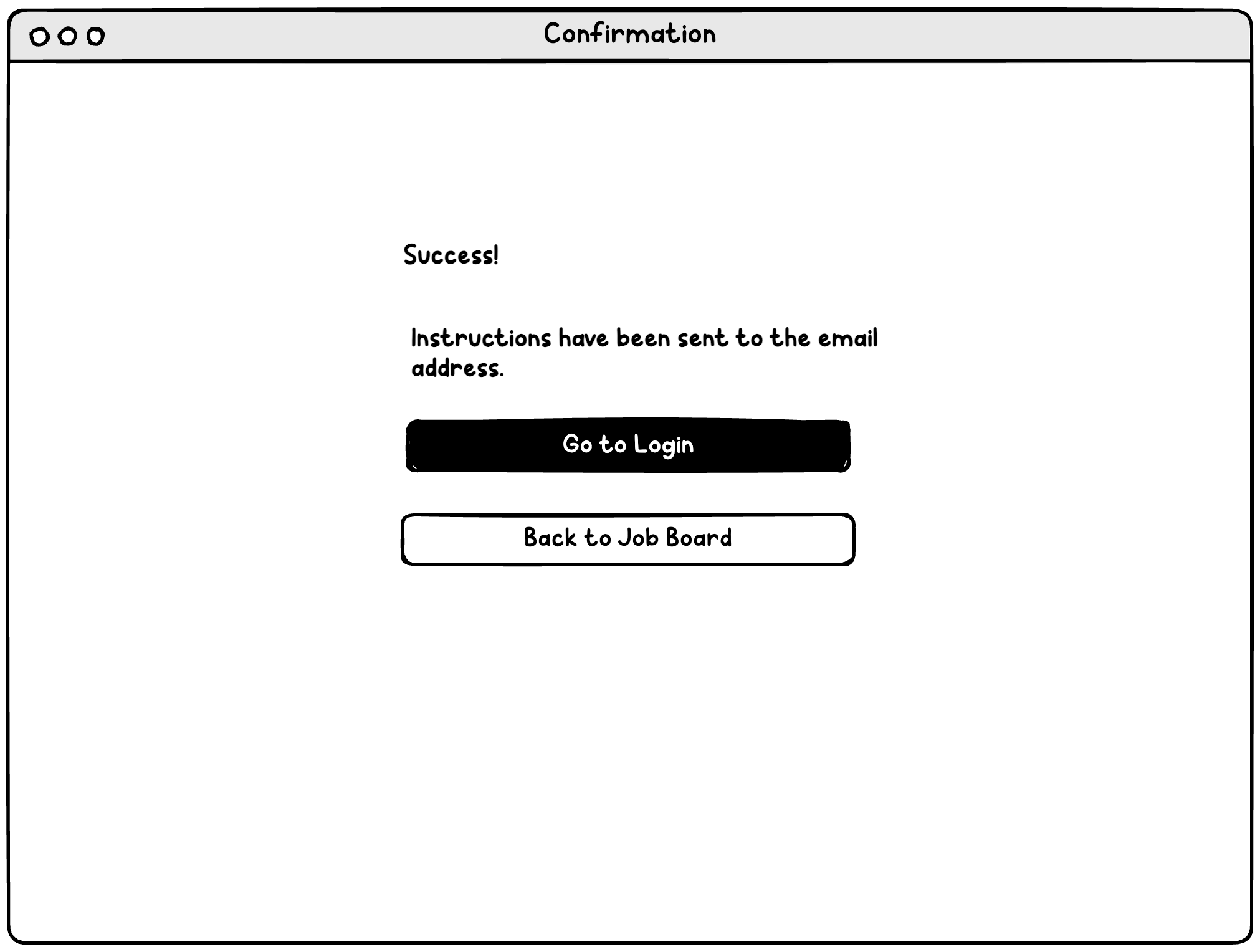
Email sent (if email on file)
Log in
Upload resume if desired
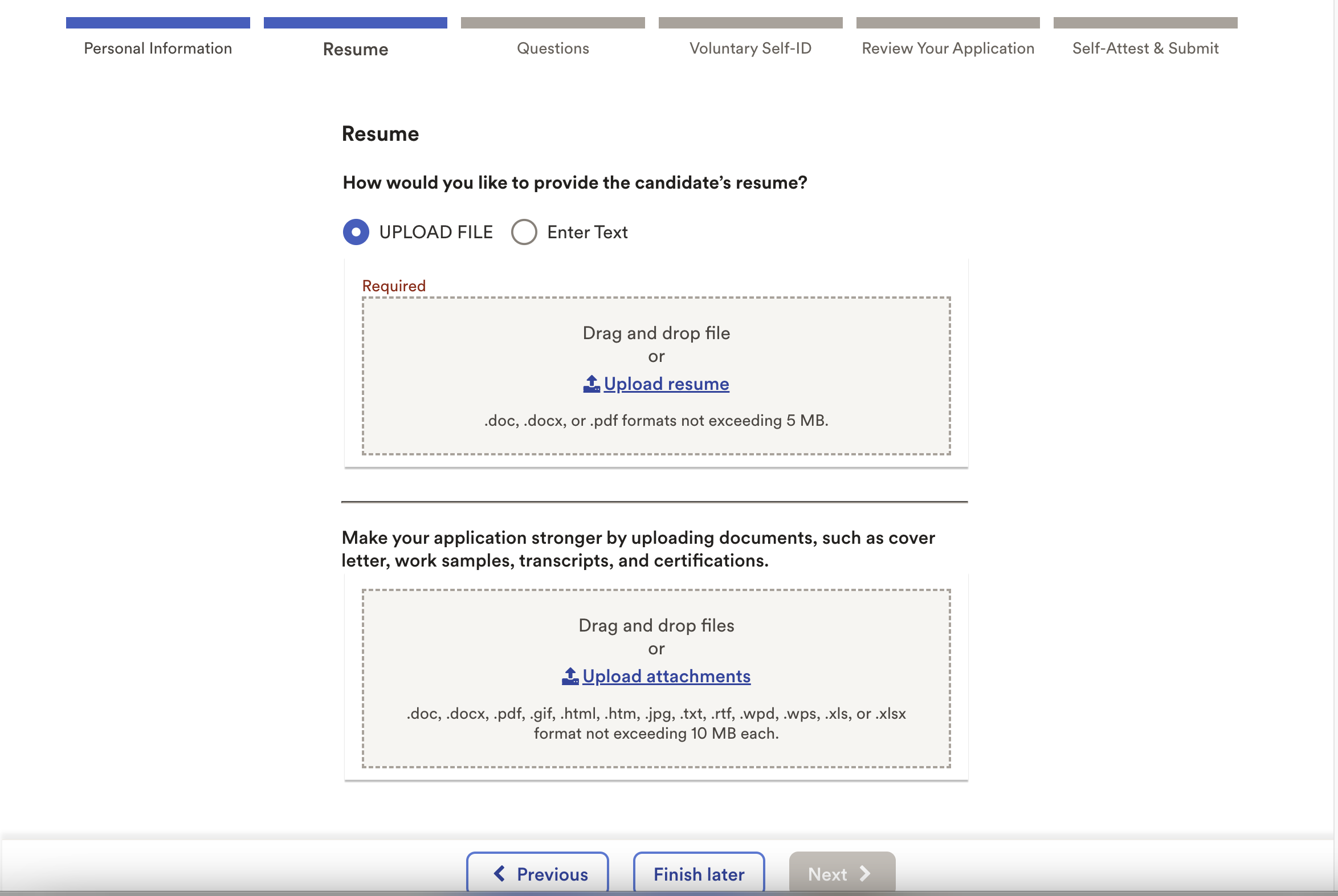
Use single column, simplify, and keep buttons visible.
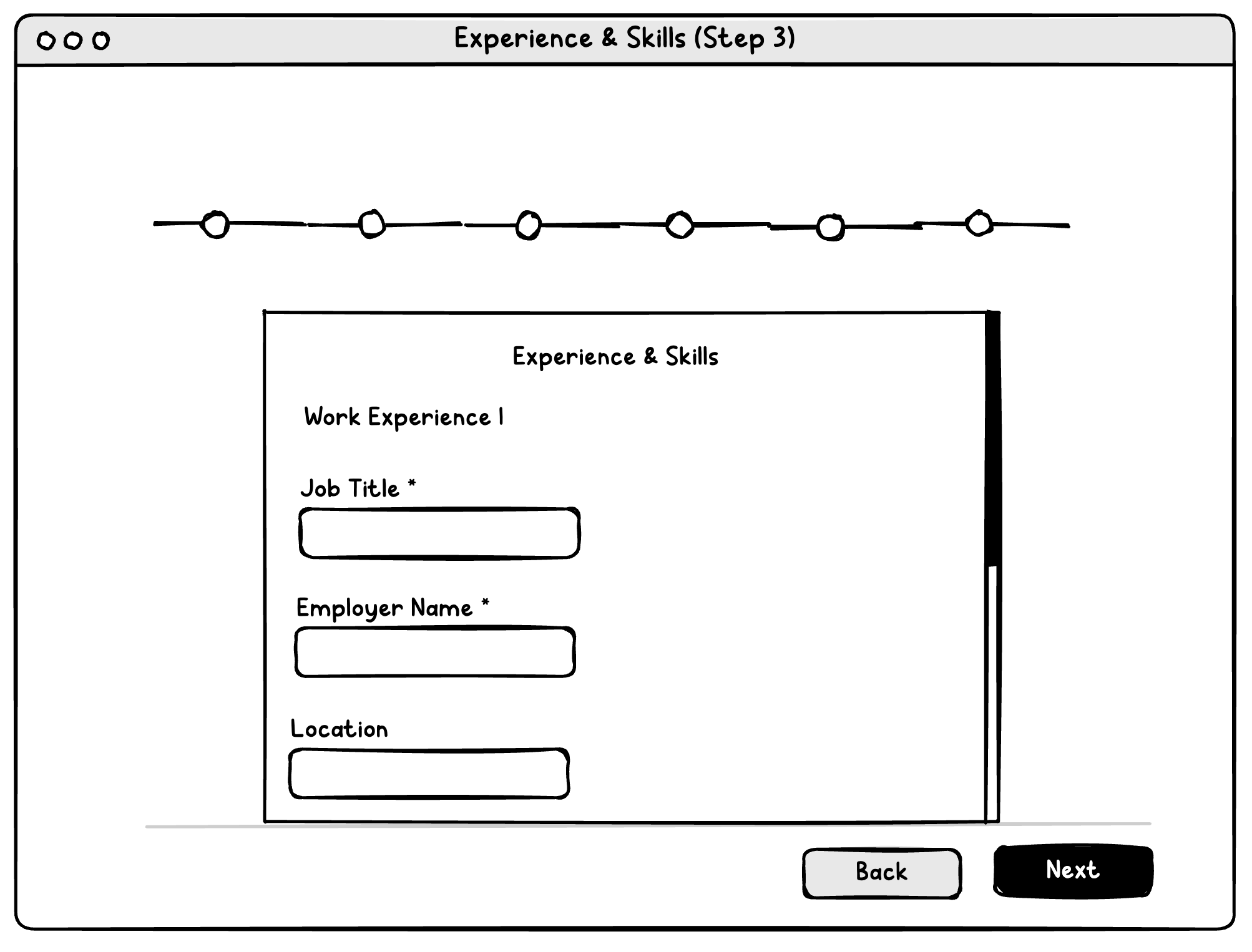
Combine experience, education/certifications, etc. into one simple step, eliminating fields like "Job Function" that will cause parsing issues.
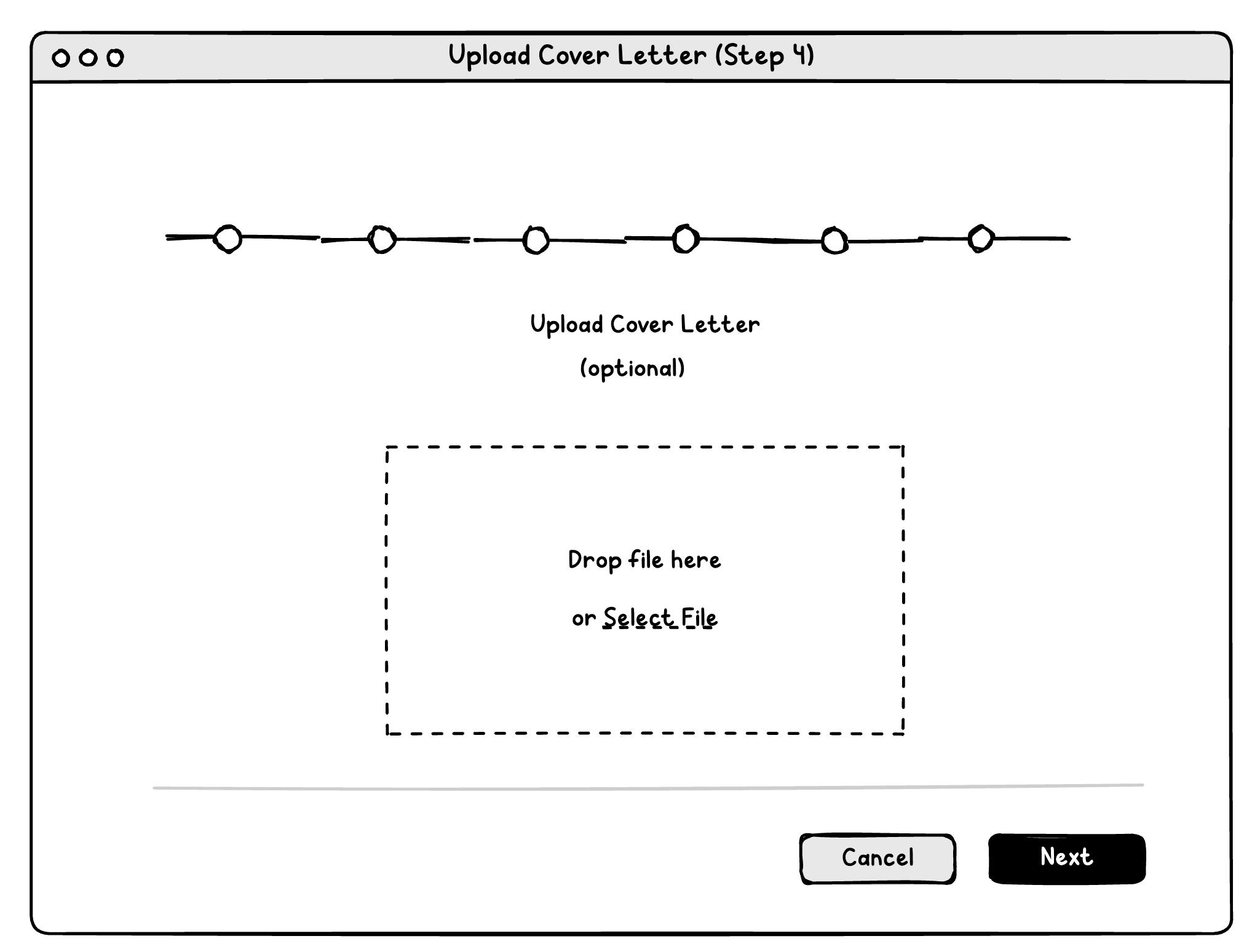
Upload cover letter/other attachments
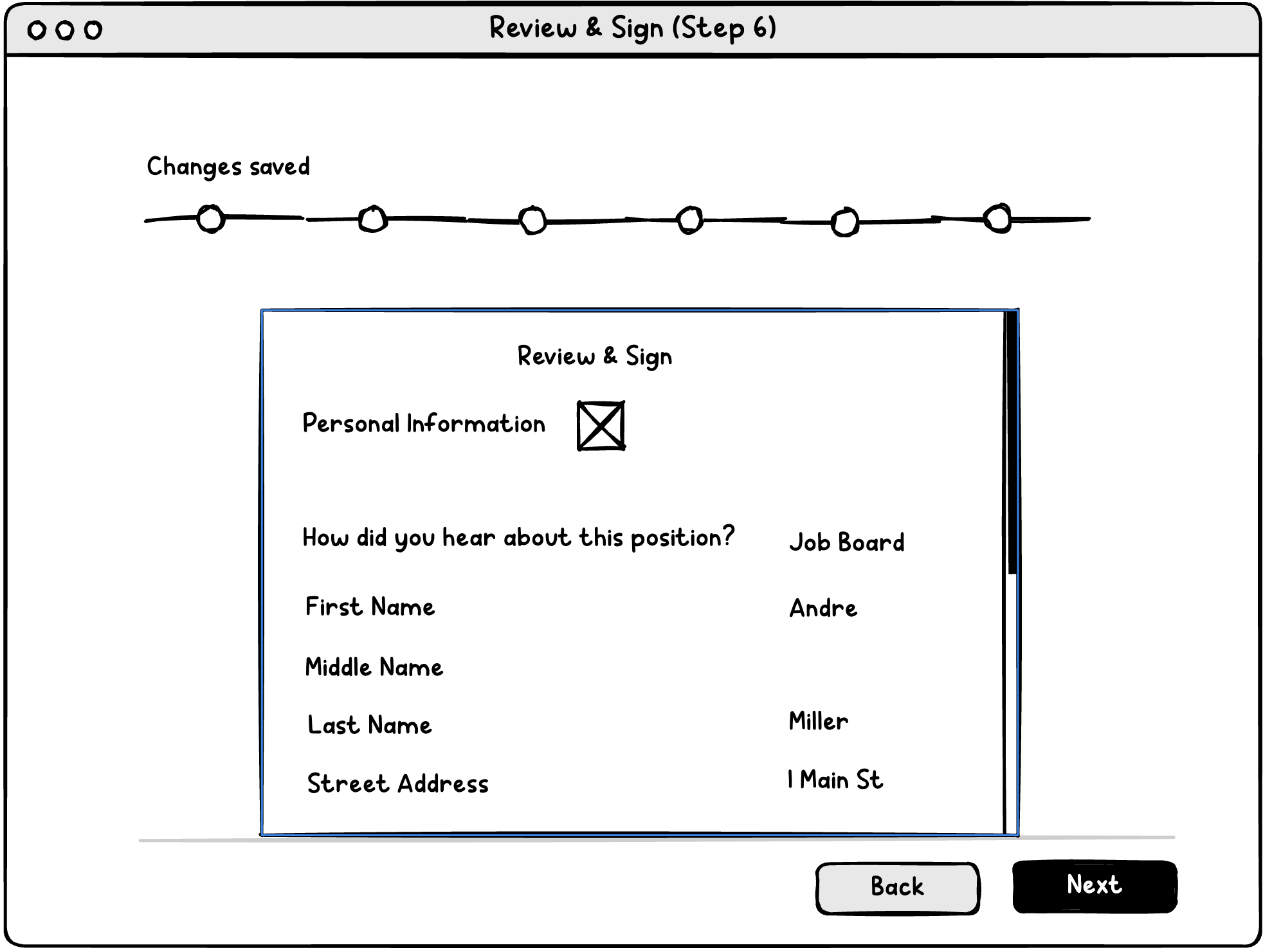
Review and sign
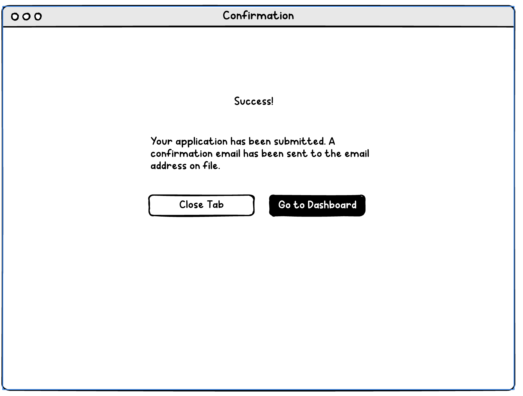
Confirmation
Recommendations / Mockups
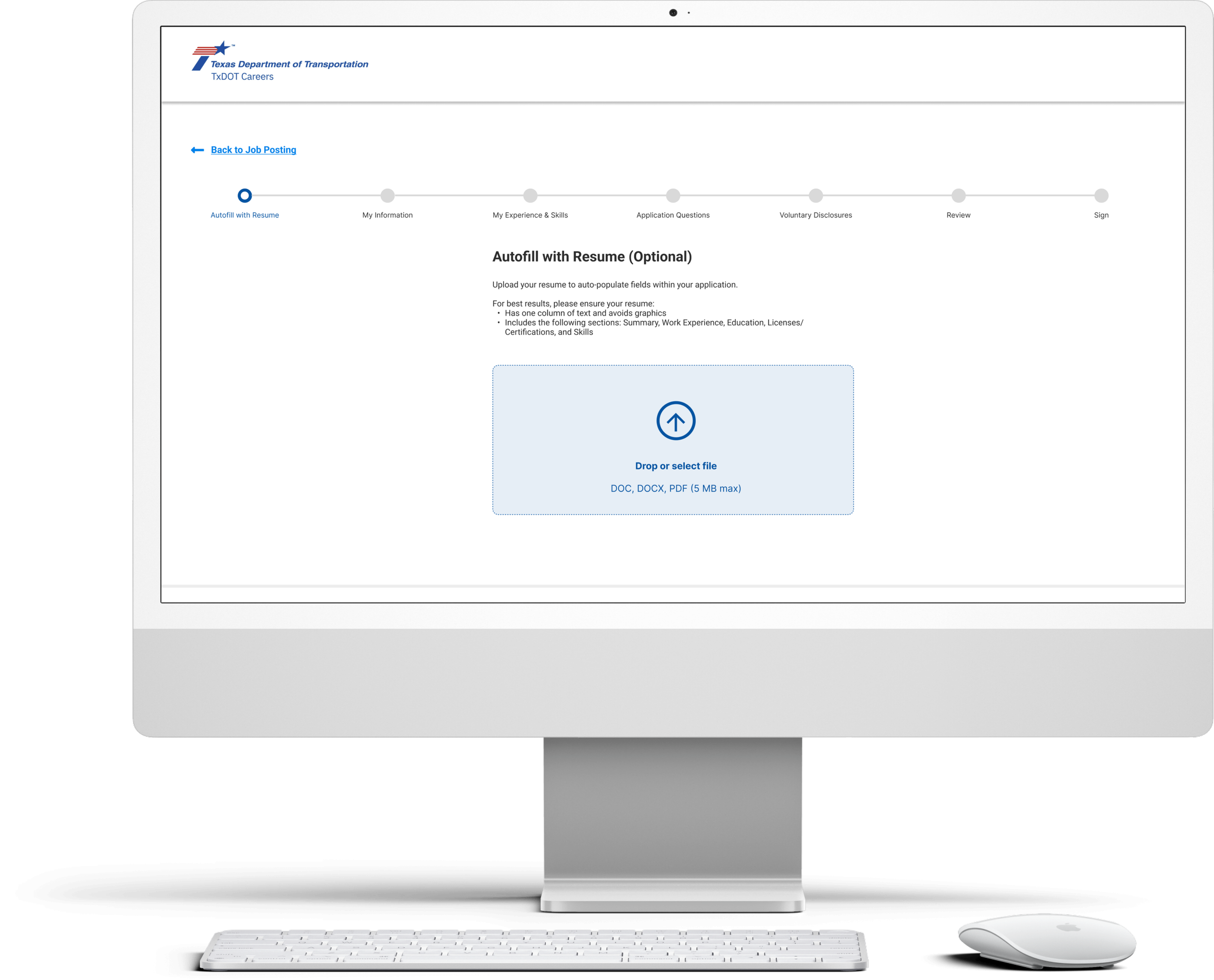
Modern UI
Clean, modern UI
TxDOT brand colors used
Visuals used in lieu of text when possible
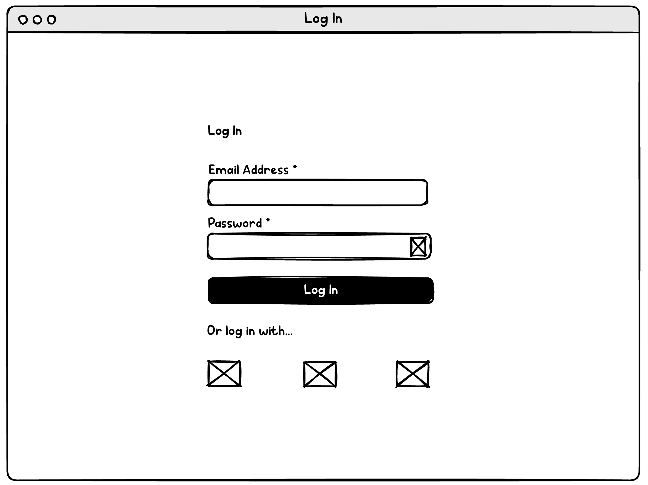
Easy Account Creation
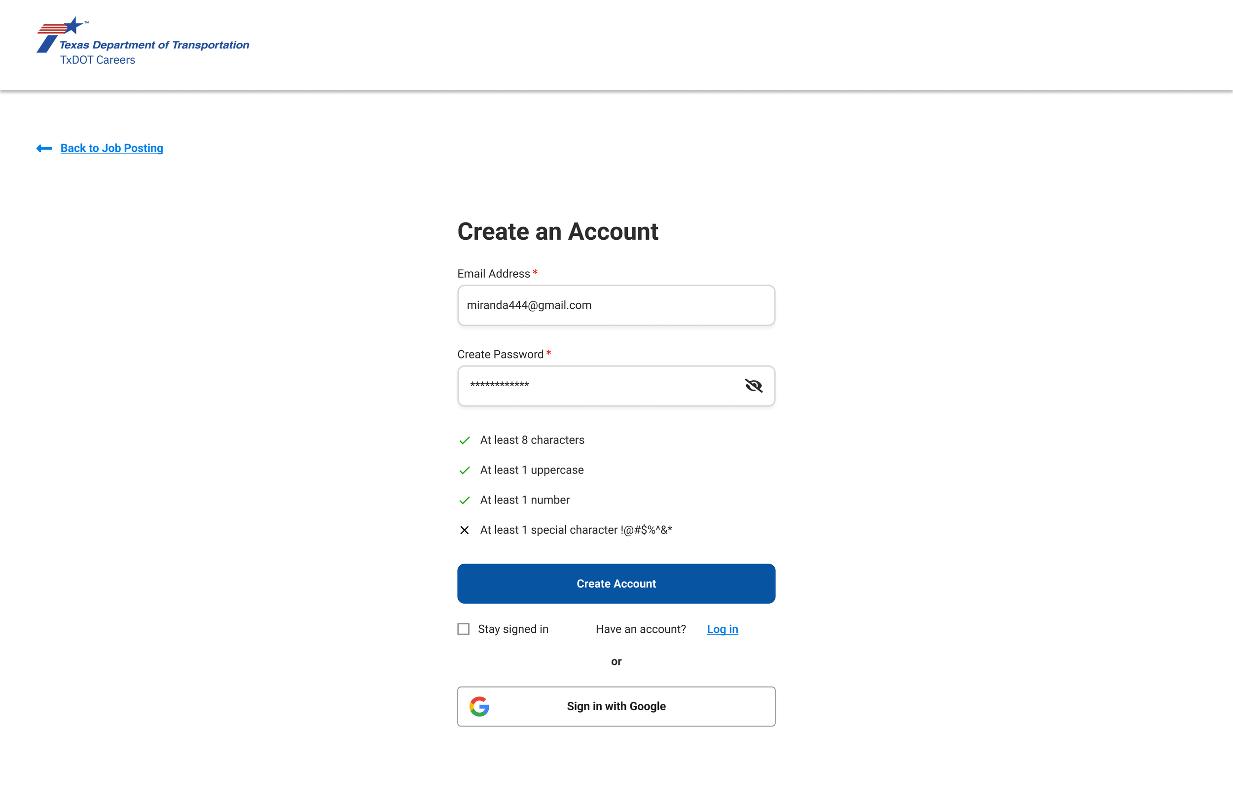
Username = Email Address
Hide/show password
Password requirements clearly displayed & updated
Sign in with Google
Option to stay logged in - explore whether one central account can be made for all applications using CAPPS (different entities)
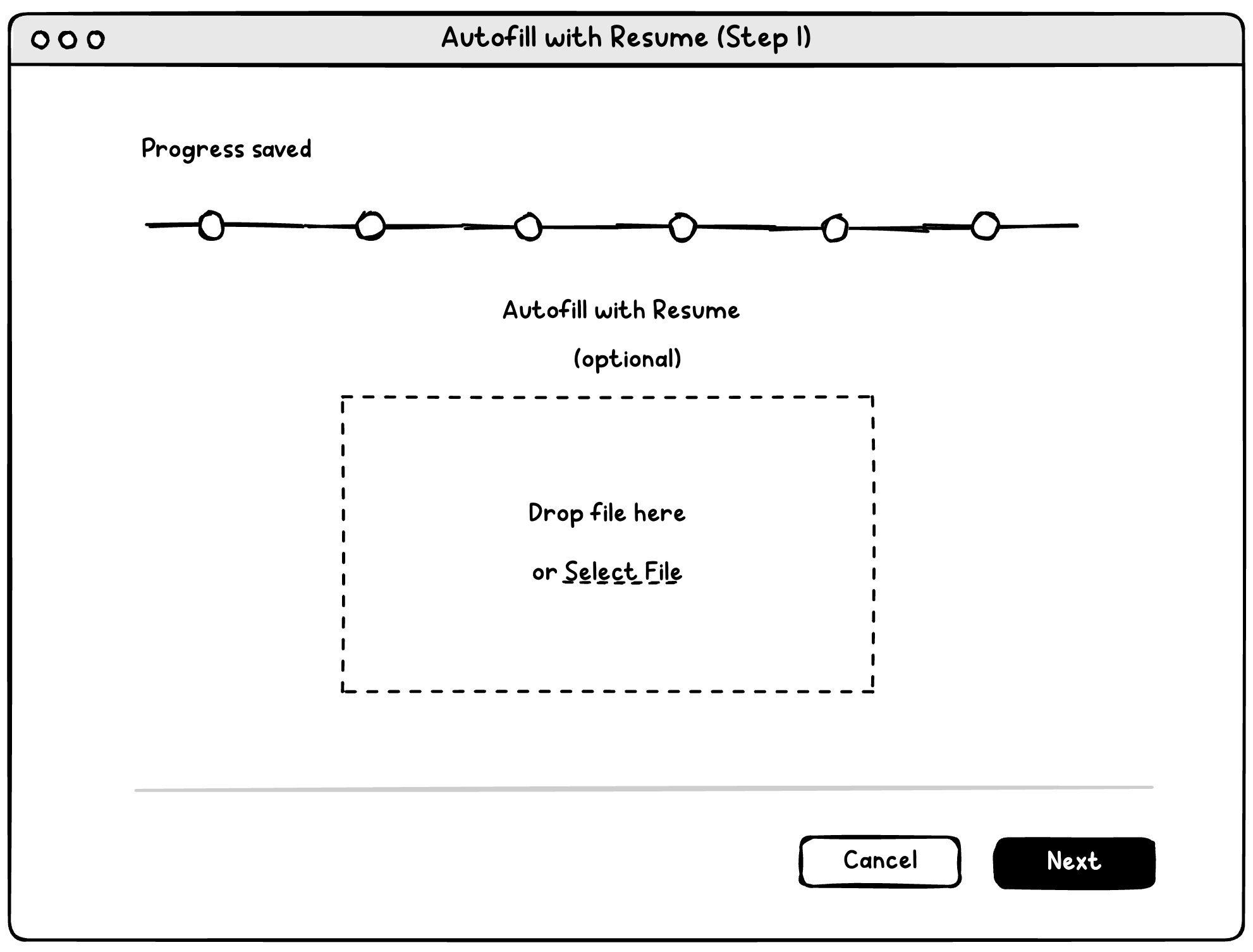
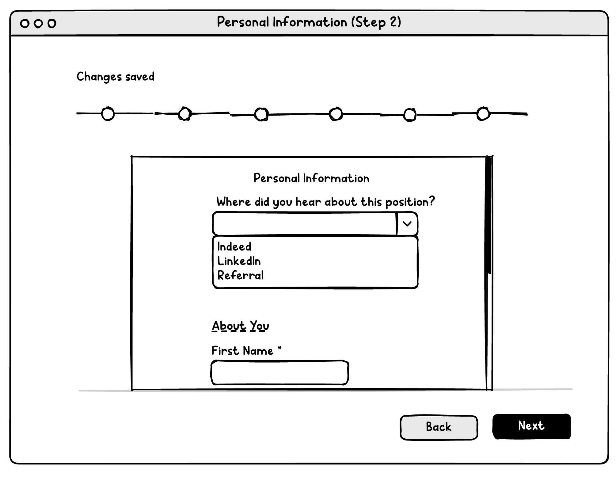
Accessible, Intuitive Form
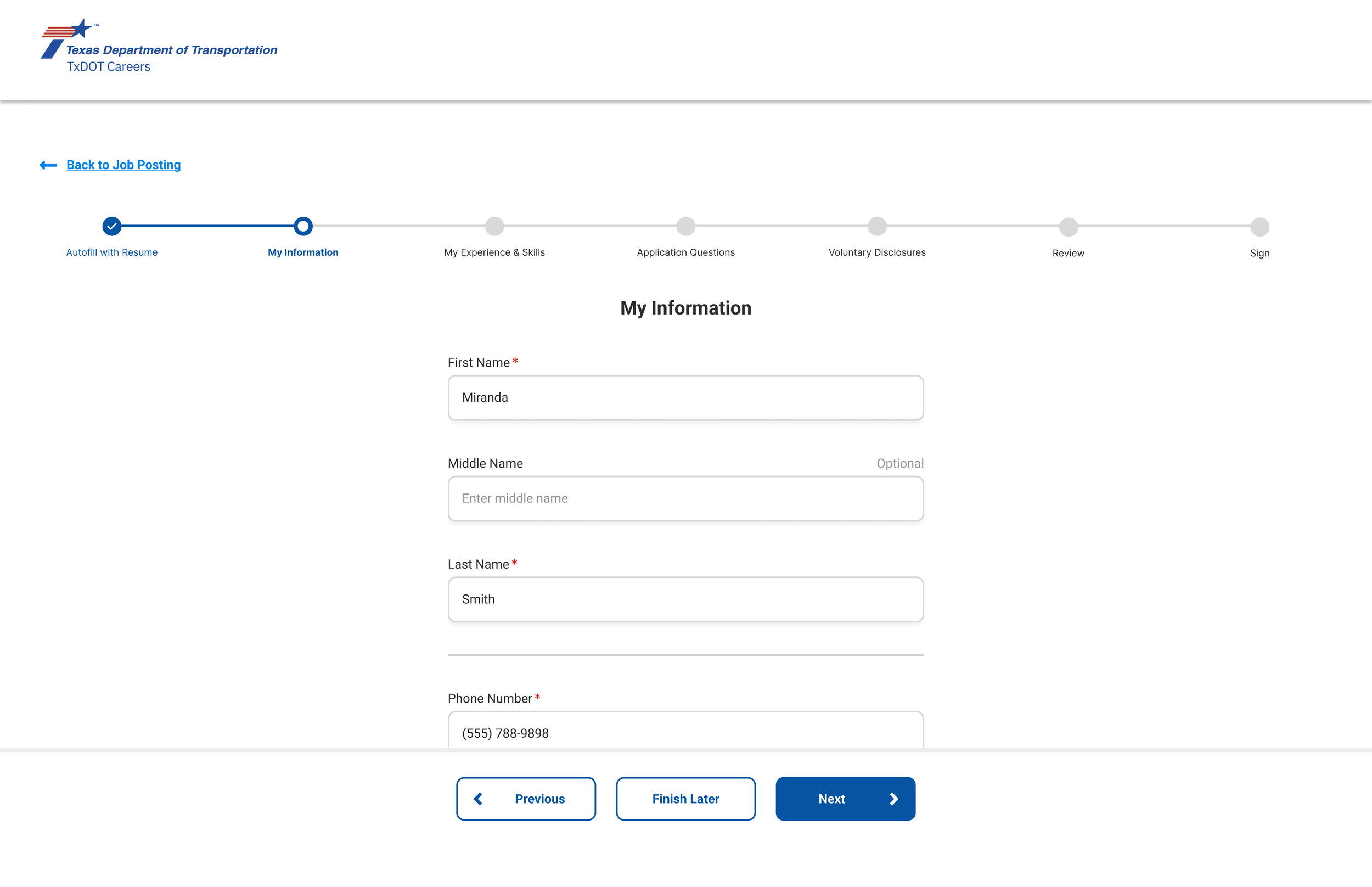
Modern stepper clearly showing progress
Single column of input fields
Unnecessary fields eliminated, improving resume parsing and reducing frustration
Information organized in a logical manner
Unnecessary text instructions eliminated
Clear, fixed buttons at the bottom (“Next” remains disabled until all required fields completed)
Transparent Voluntary Disclosure Questions
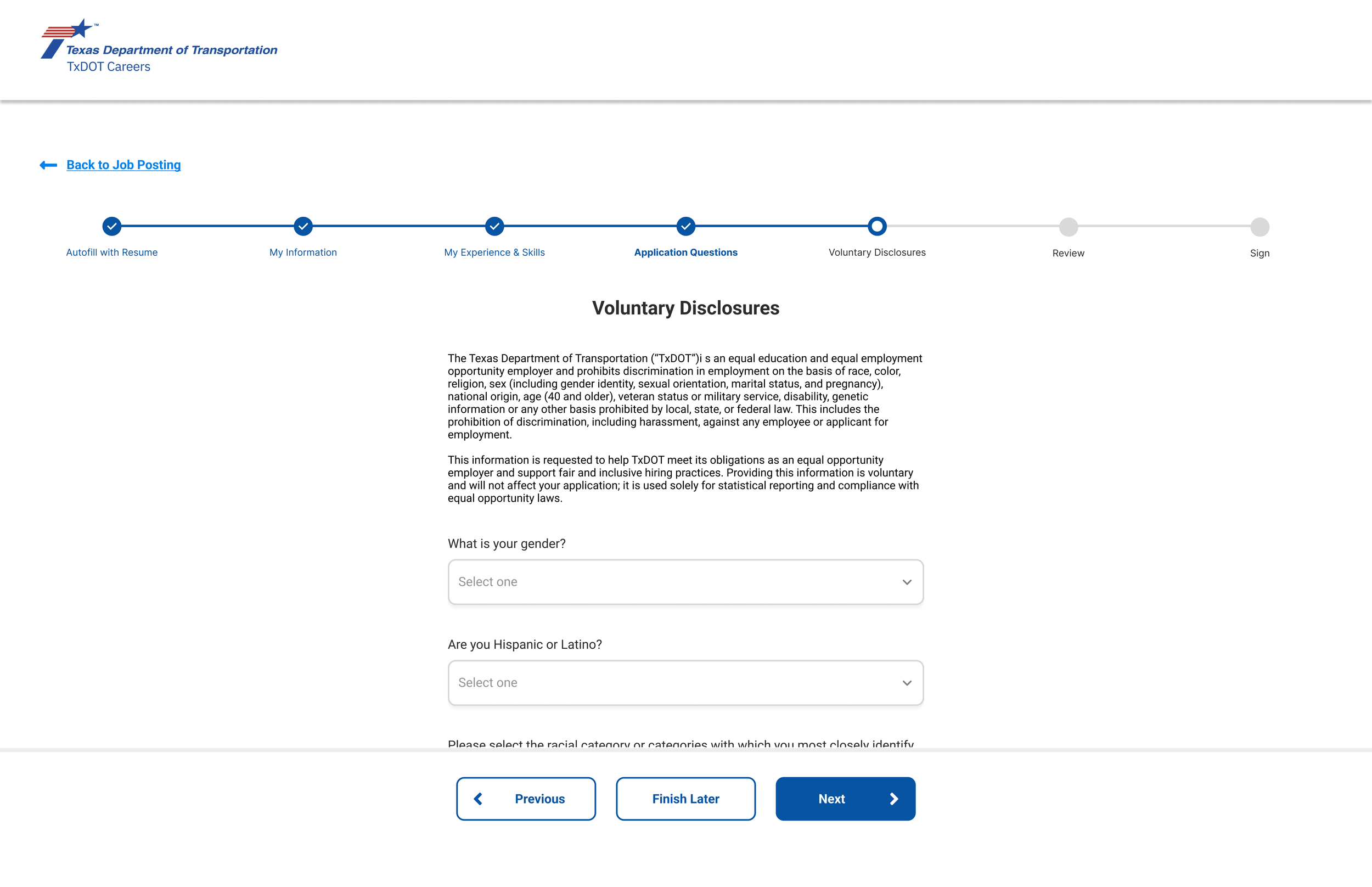
Anti-discrimination notice provided
Voluntary disclosure questions are marked as optional
Military and former foster preference questions included with application questions, rather than voluntary disclosure questions
Prototype
Try out the prototype below, completing an application for a job position at TxDOT using the redesigned CAPPS application system.
Expected Results:
Improved candidate experience, resulting in employers attracting high-quality talent, improving brand image, and increasing diversity
Reduced waste - for example, candidates will be less likely to contact tech support for issues with the application process
Improved reputation of Texas government agencies such TxDOT
Additional Recommendations:
Interview/survey job applications who have used the CAPPS system to apply
Interview/survey hiring managers who use the CAPPS system to gather insights
Speak with employer stakeholders to understand legal and organizational requirements the form may require
Test the prototype and further iterate upon design
Ensure mobile responsiveness
Like what you see?
Get in touch to explore how we can collaborate.