Brand Identity Shift & Custom Webflow Site
In this project, I took a UX approach in independently designing and developing a spiritual content creator's first official website/landing page, also contributing to a brand identity shift.
Contributions: UX/UI Design, Web Design & Development, Writing & Content Strategy, Brand Design
Dates: 2024 - 2025
Problem
Most of the early content from the content creator's page was focused on the occult, which attracted a large following interested in that subject.
However, with time the creator shifted away from the occult and into spiritually based personal development.
At the same time, he thought a website where he could have all his links would be very helpful. He didn’t realize at
Analyzing the Market
I started by conducting a market analysis or indirect and direct competitors to see what other similar businesses are doing on their websites. I found that many of them offered newsletters and blogs.
User Research
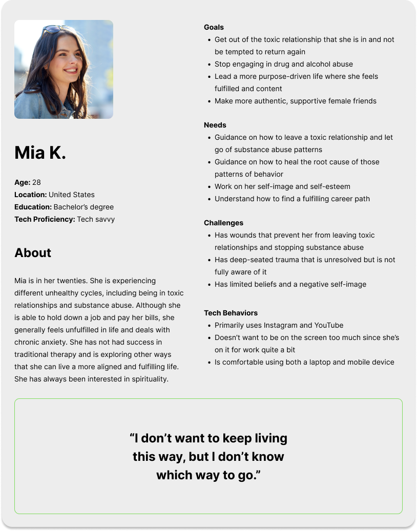
Next, I conducted user research to better understand the needs, goals, and pain points of the creator's followers, interviewing 2 individuals and collecting 75 survey responses (all followers of the creator).
I created a user persona using this data to inform the design process. This persona reflects a lot of the data that was collected.
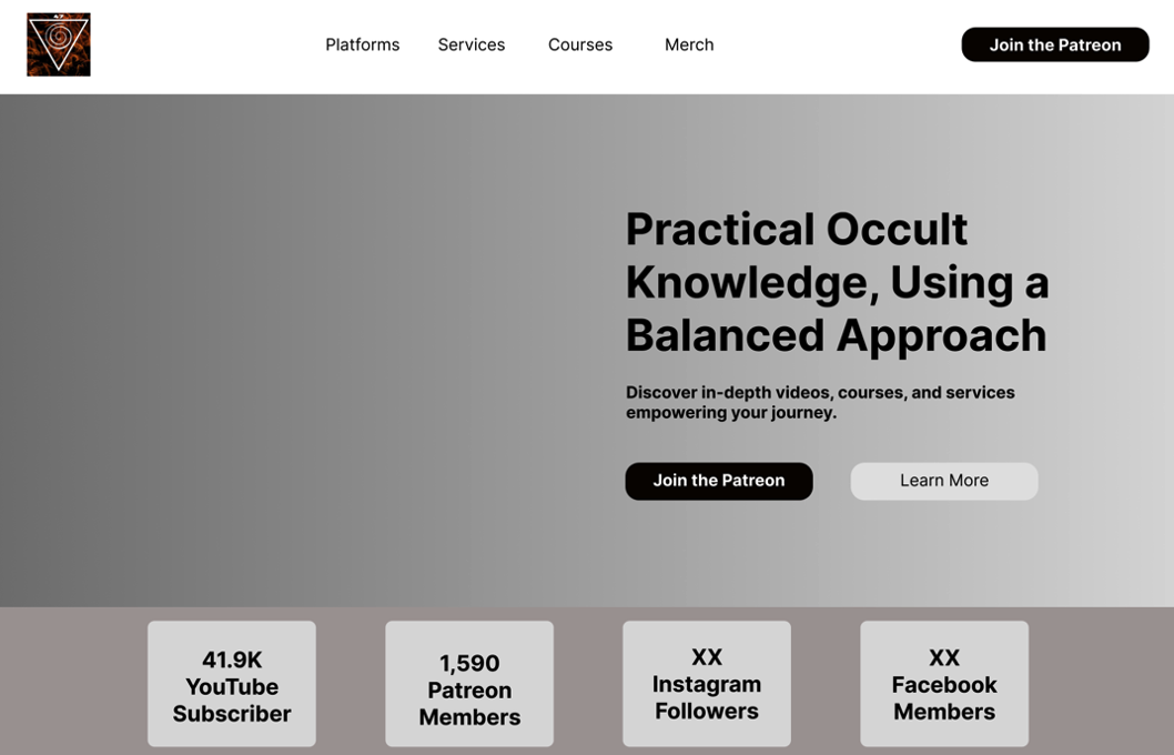
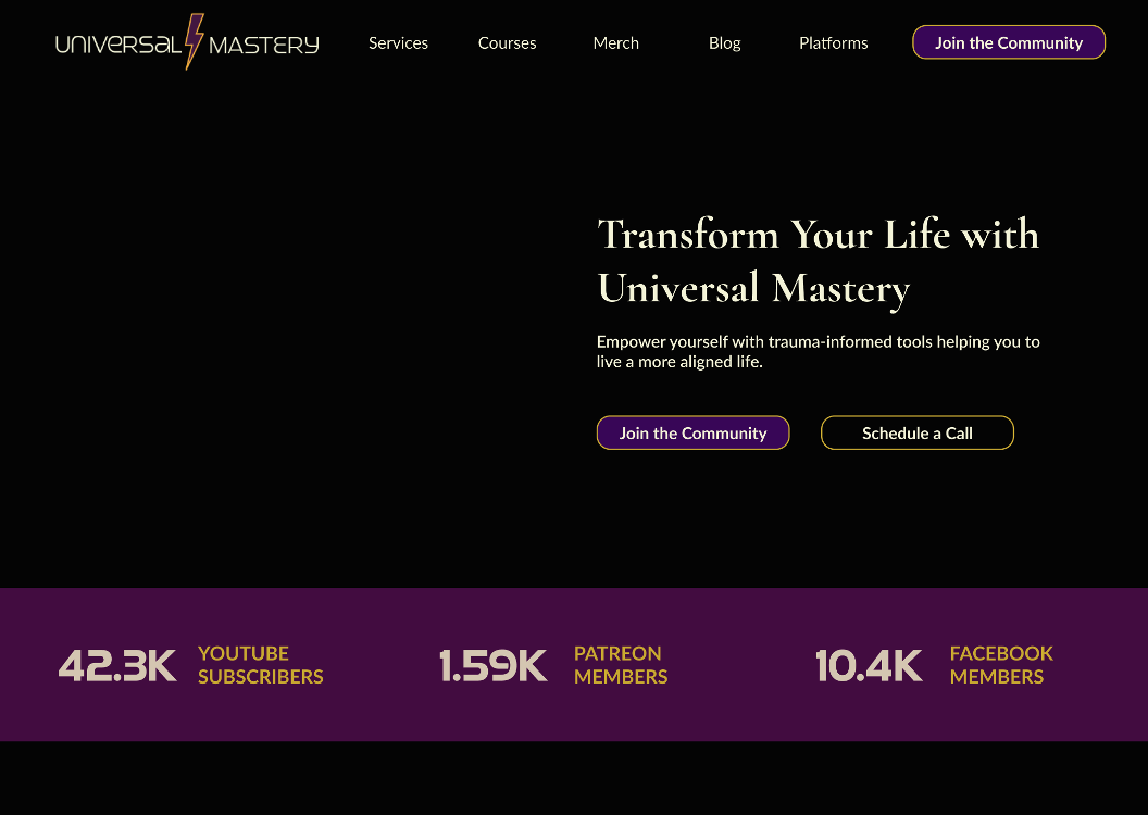
Iterative Design Process: Wireframes
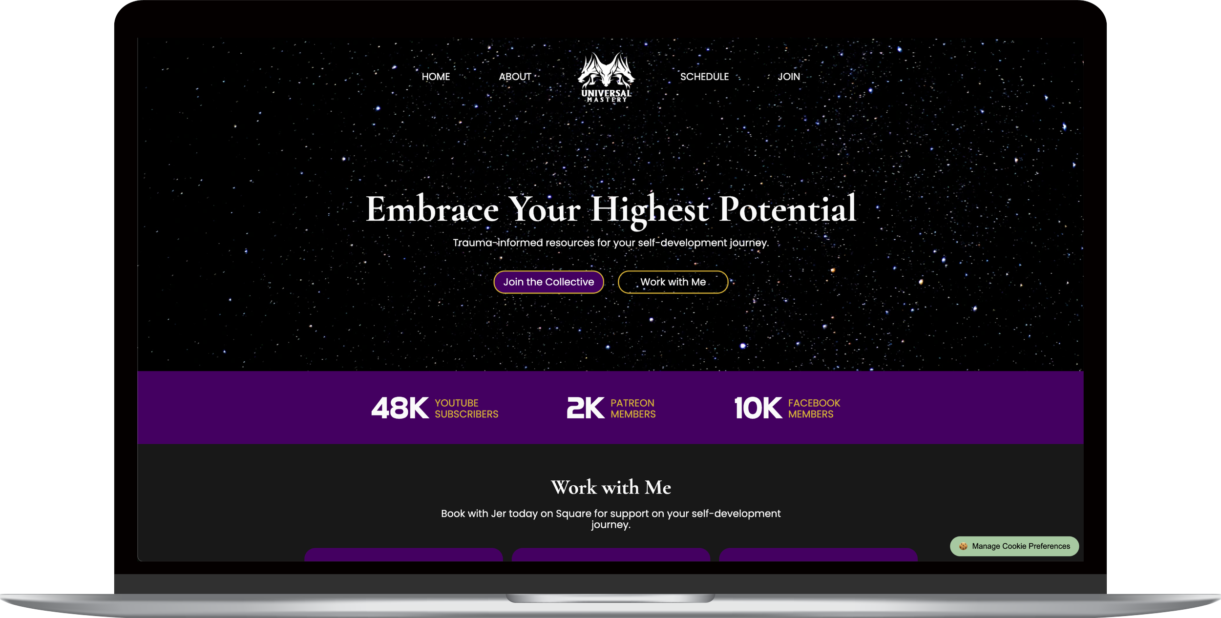
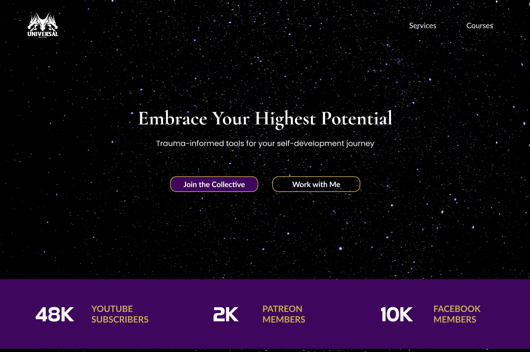
As we progressed in the project, we naturally began to shift into the new brand identity, away from the occult and into spiritual personal development. In doing so, the brand design began to shift to purple and gold, with updated messaging.
I suggested purple and gold for two reasons: first, according to the survey responses the creator has about half and half ratio of male to female followers. Purple seems like a neutral choice that could appeal to both groups.
In addition, purple and gold signify mystery and royalty, tying into the esoteric theme while creating more of a sense of peace than the red and black used previously in video thumbnails and the original logo.
I used Figma to create the mockups.
Usability Testing
To ensure the website’s functionality and improve its usability, I conducted usability testing with 3 participants, also members of the client’s online following. Here are some of the changes made as a result of testing:
Updated the secondary button CTA in the hero section to make it more understandable.
Ensured mobile responsiveness with the email newsletter signup.
Updated the CTA wording in the Services section to make it more accessible.
Ensured alignment of all buttons.
Final Mockups
In the end, we developed the website using Webflow to enable full customization.
I developed the design in Webflow, implemented custom code where necessary and ensuring mobile compatibility.
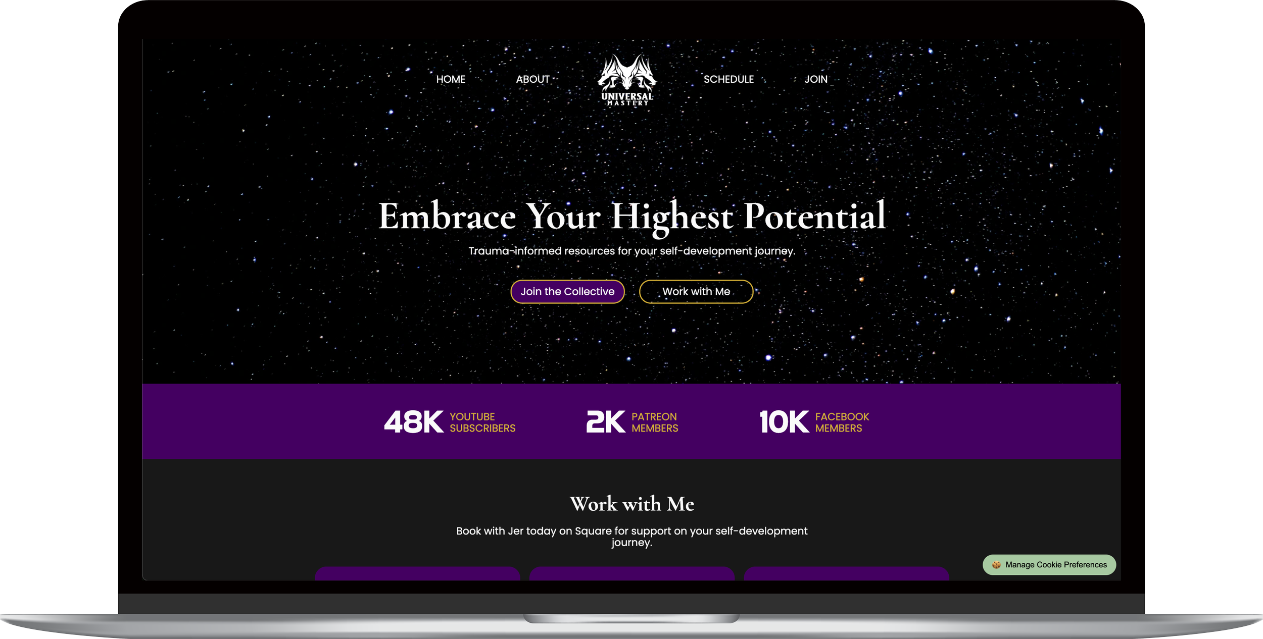
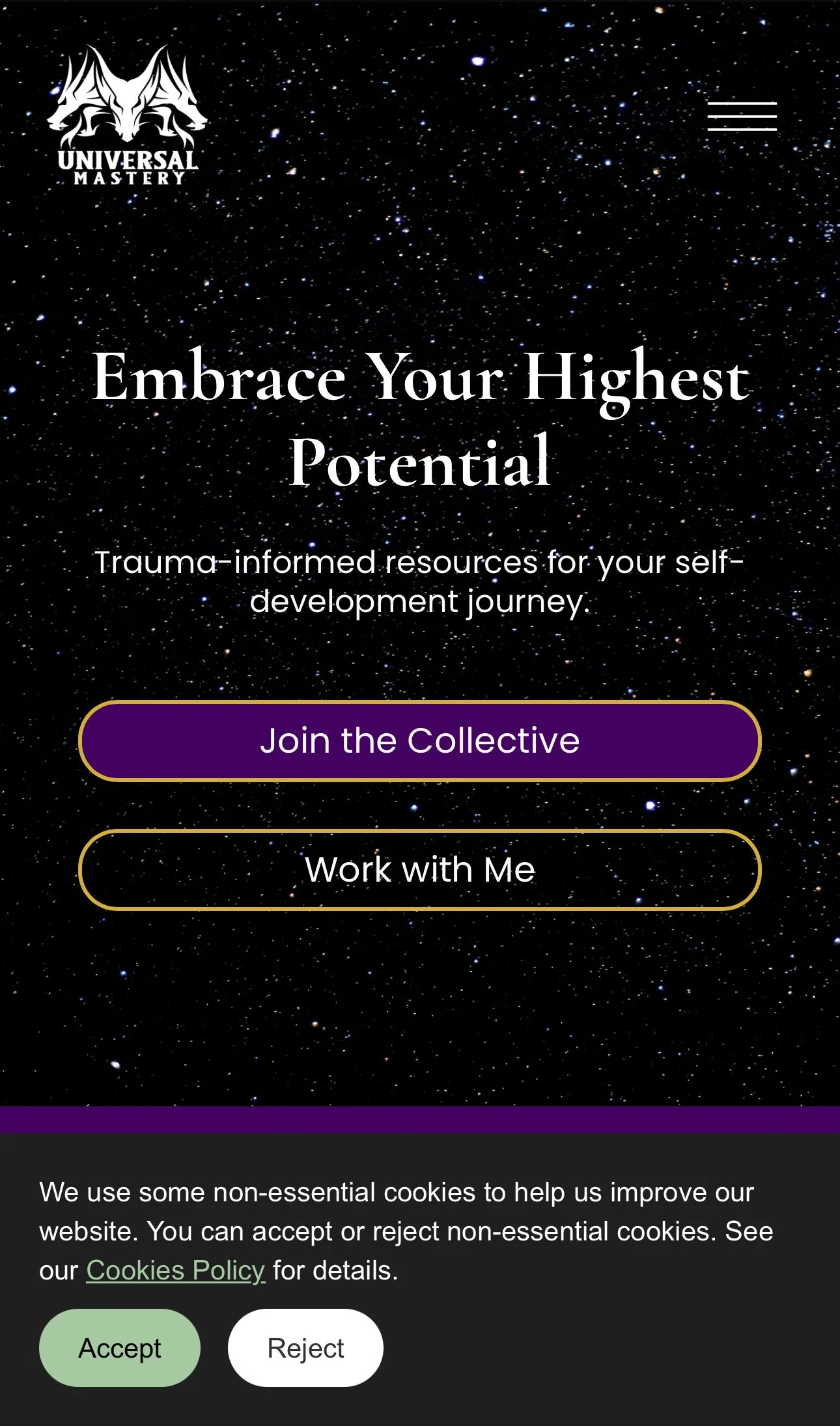
The hero section sections has clear CTAs, stats that build social proof, and updated branding. I created the cookies popup using custom code, to enable alignment with the branding and compliance with data privacy standards.
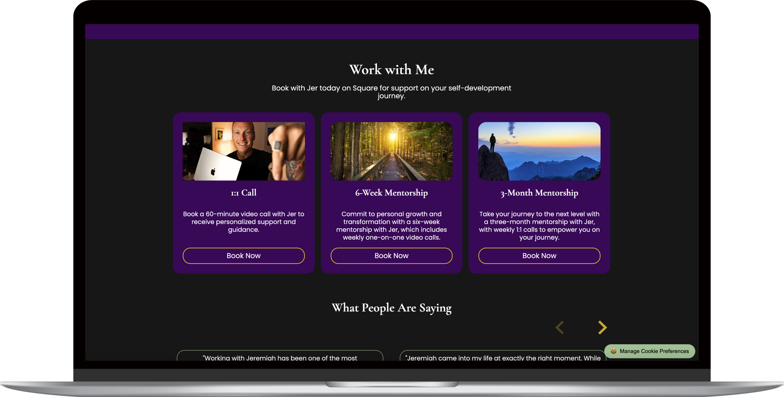
Services are clearly displayed and described.
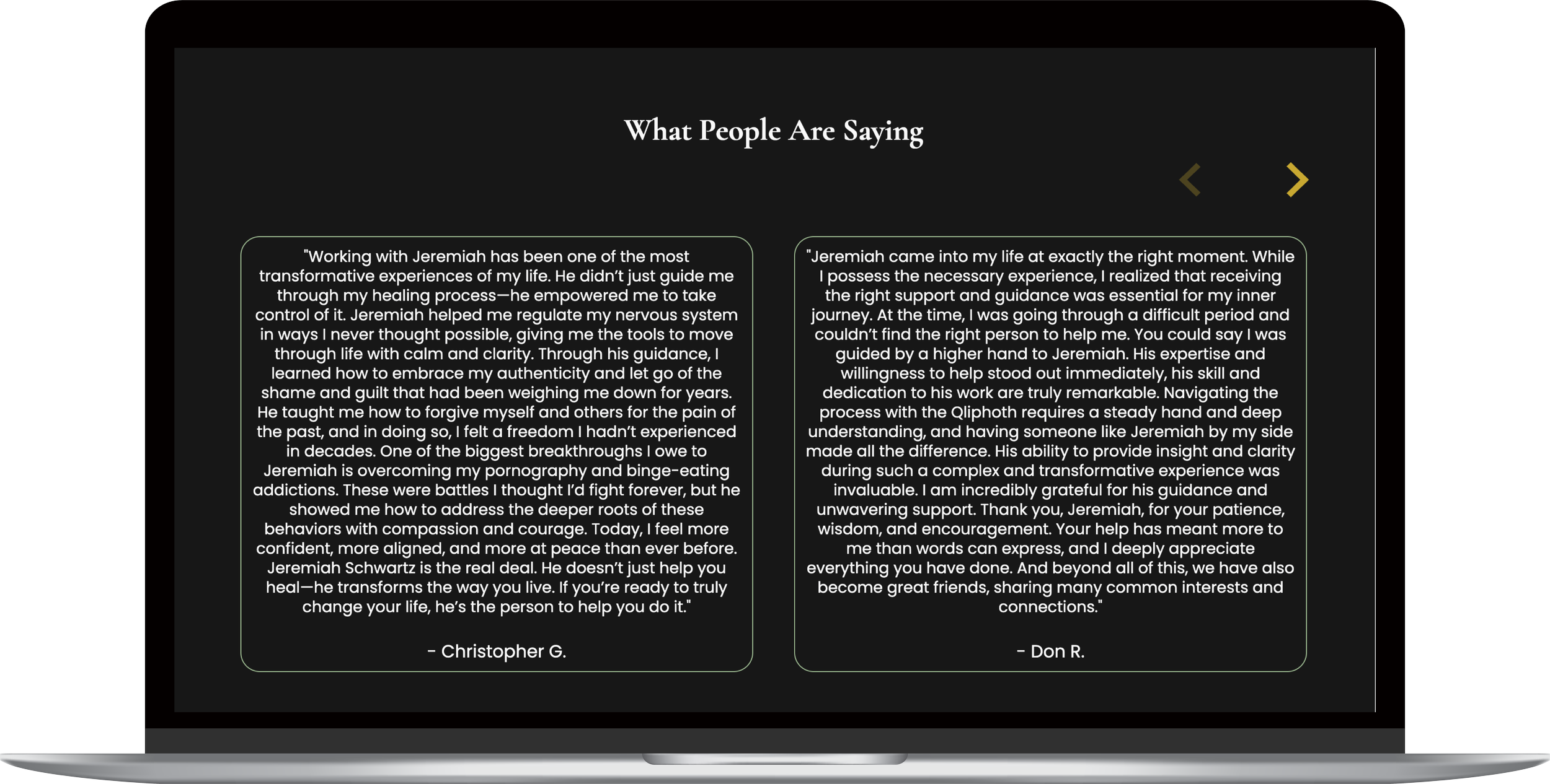
Testimonials help to establish trust. Custom slider that aligns with the site theme.
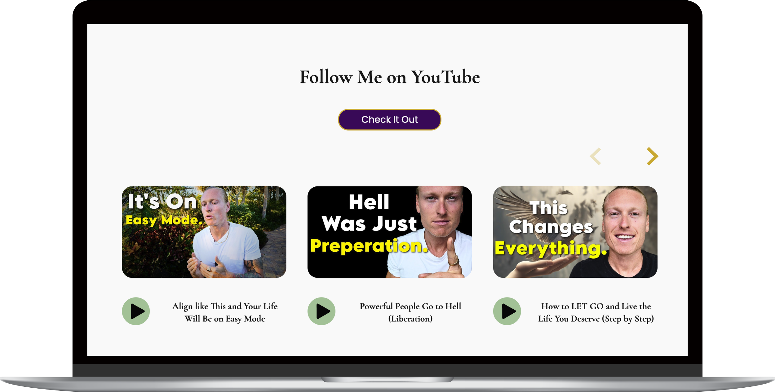
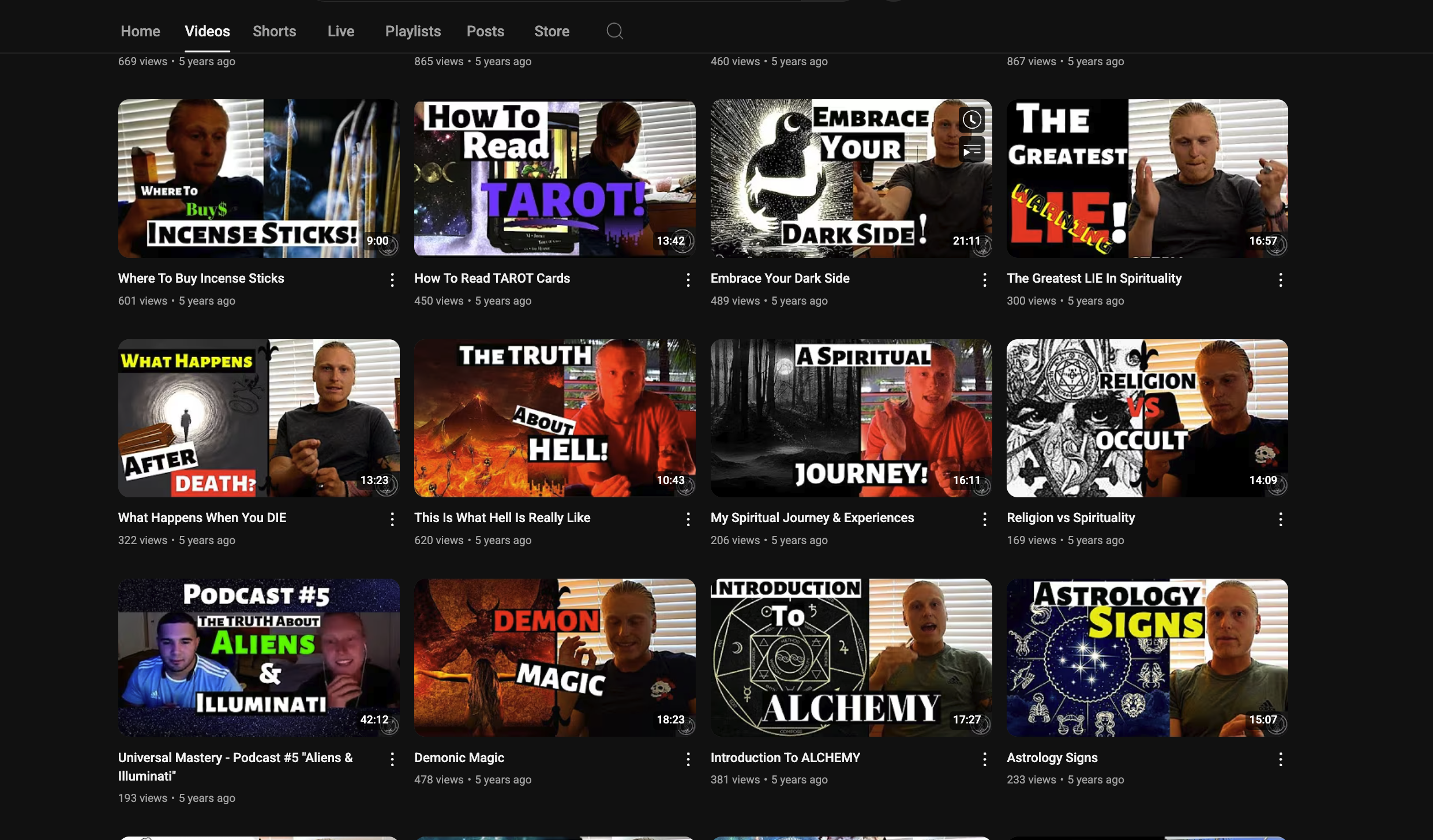
Links to YouTube videos helping direct traffic to the creator's number one public platform.
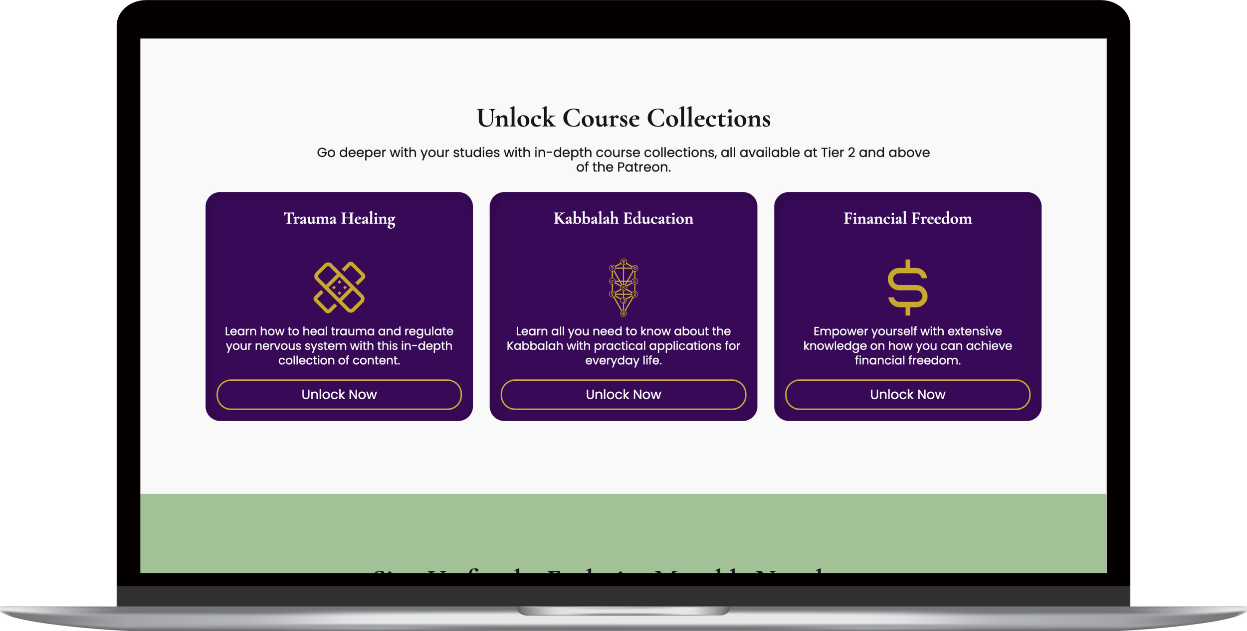
Content collections in Patreon are framed as Courses, supporting the brand's expansion.
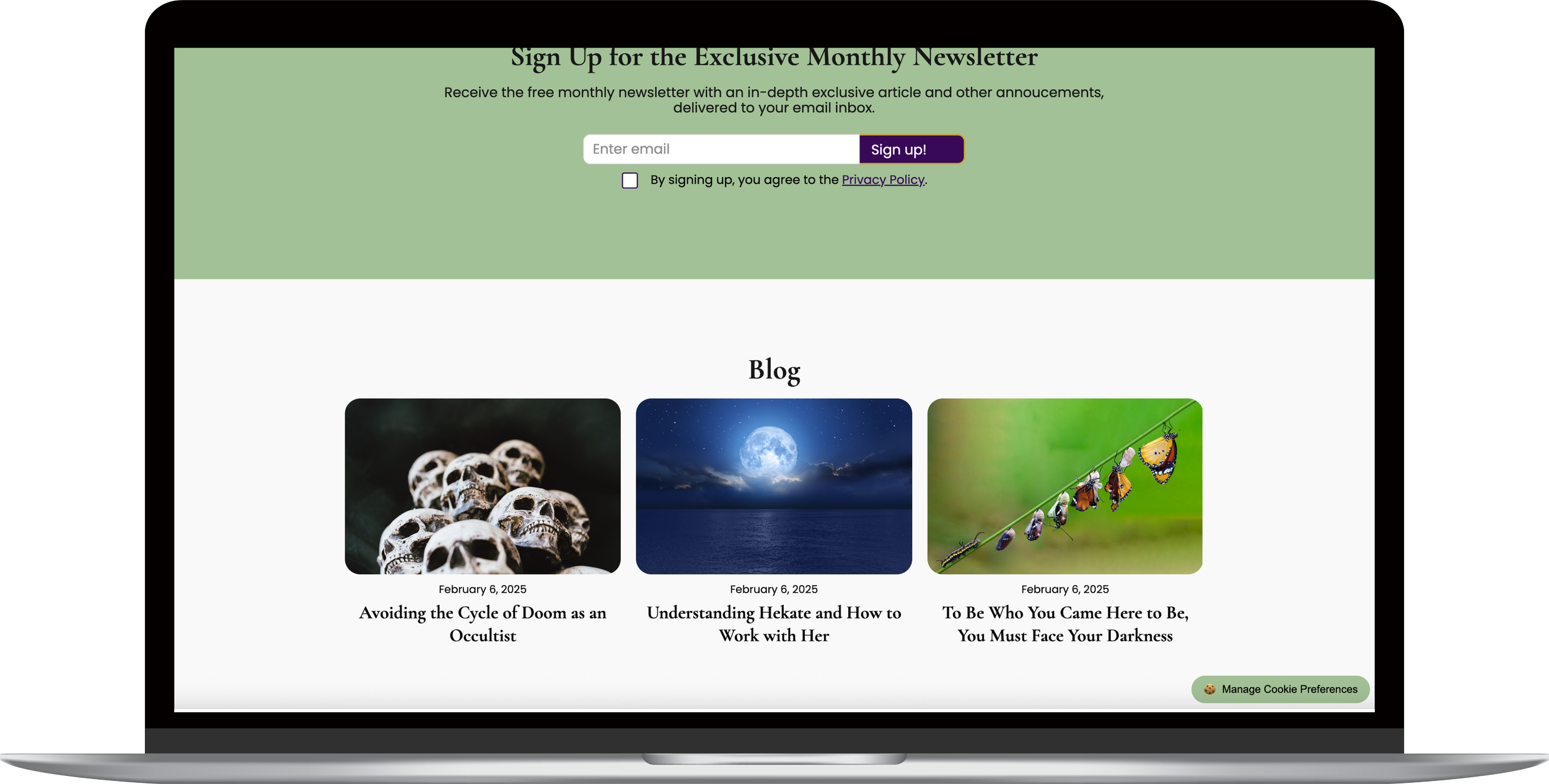
A blog helps direct traffic to the site and features links to related videos and services.
The custom site is mobile friendly.
Impact
Renewed brand identity.
Client begins to build an email newsletter list, which is very valuable as a content creator.
Increased sales for services and Patreon memberships.
New content ideas based on user research that was conducted, which all received positive feedback.
Recommended Next Steps
Update the links. The client changed the brand name after the project ended, so many of the links leading off the page don't currently work.
Update the website design and domain to align with the furthered refined brand identity.
Integrate booking and checkout onto the website (rather than using Square for services).
Consider building a web app in the future that offers community and educational resources.